2026 Winner
GoldAToMiC IP
SilverAToMiC Design
Safehaven
"Where Hope Lives"
The Local Collective
"Where Hope Lives"
The Local Collective
CASE SUMMARY
Safehaven is a Toronto-based not-for-profit that supports medically complex children, many of these kids often go unseen in public life. They are protected, often loved, but rarely engaged with. Not because people don’t care, but because they don’t know how.The challenge was to create something that would help families talk to their children about disability without feeling like they were doing something wrong. Most parents avoid the topic altogether, afraid of saying the wrong thing. That silence, however well-intended, teaches kids to look away. And while there is lots of information out there, parents didn’t have a “way in” to have these conversations naturally with their children.
The insight came from watching how kids respond when adults aren’t watching.
Children don’t naturally avoid difference. They’re curious. They ask. They want to understand. But adults step in too soon with a whispered “don’t stare” or a gentle redirection. That moment – small as it is – conditions kids to suppress their questions instead of exploring them. The protective instinct of parents unintentionally creates a cycle of disengagement.
If the agency could create a safe space for curiosity to play out naturally, they could shift the behaviour before that reflex sets in.
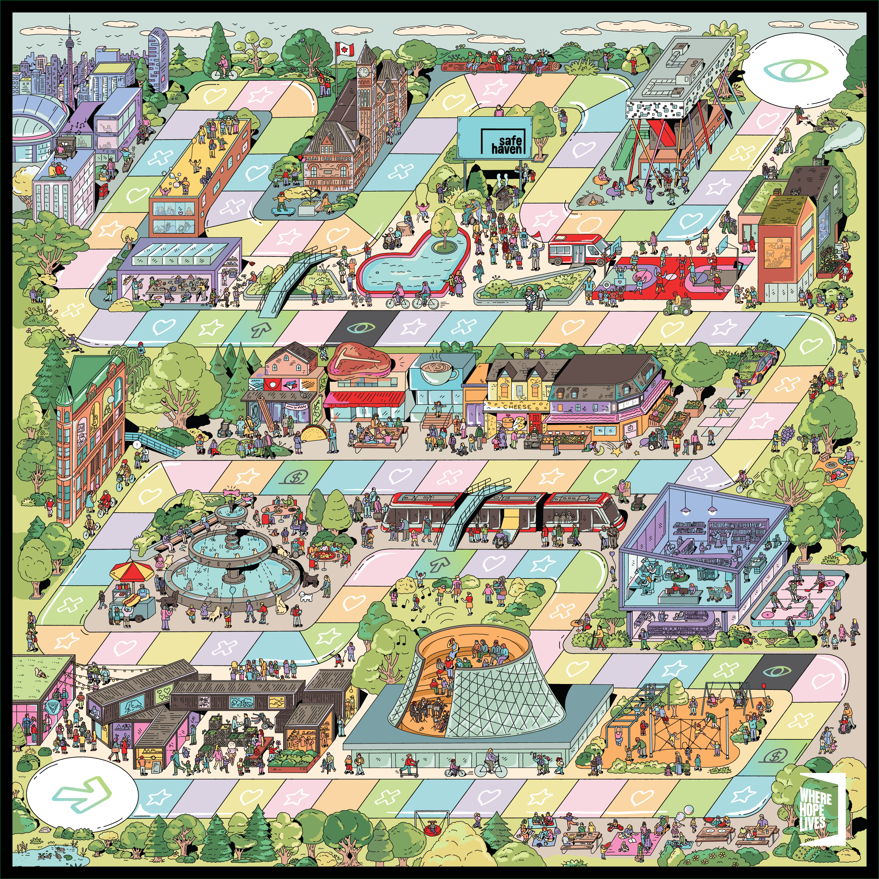
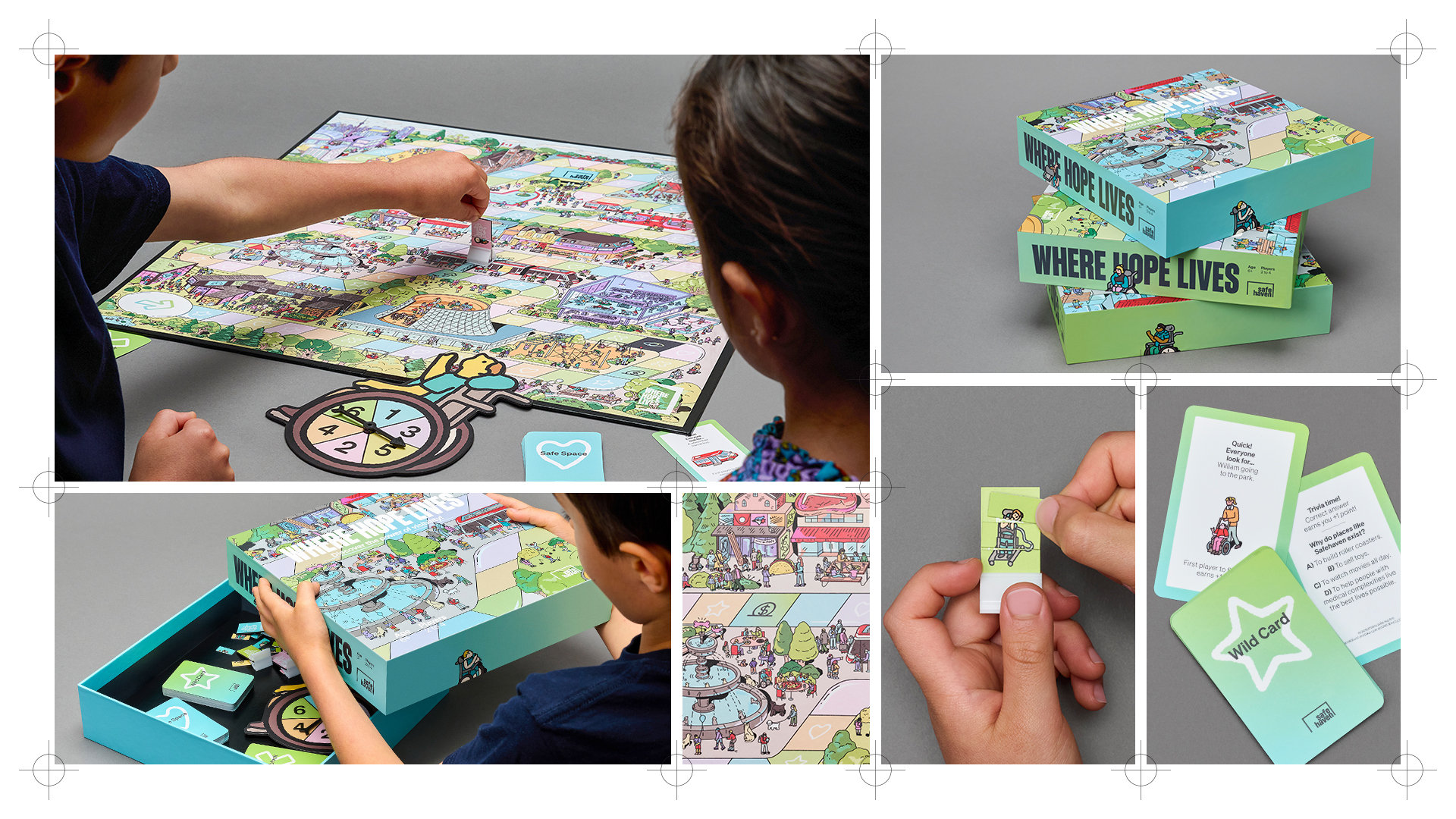
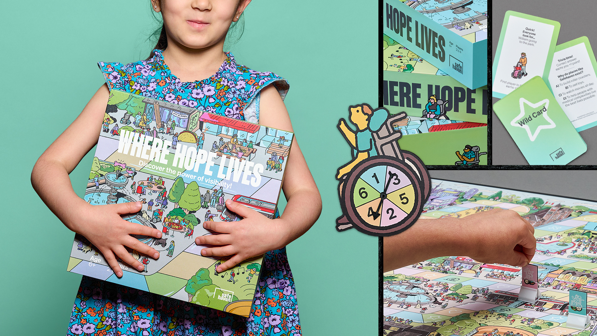
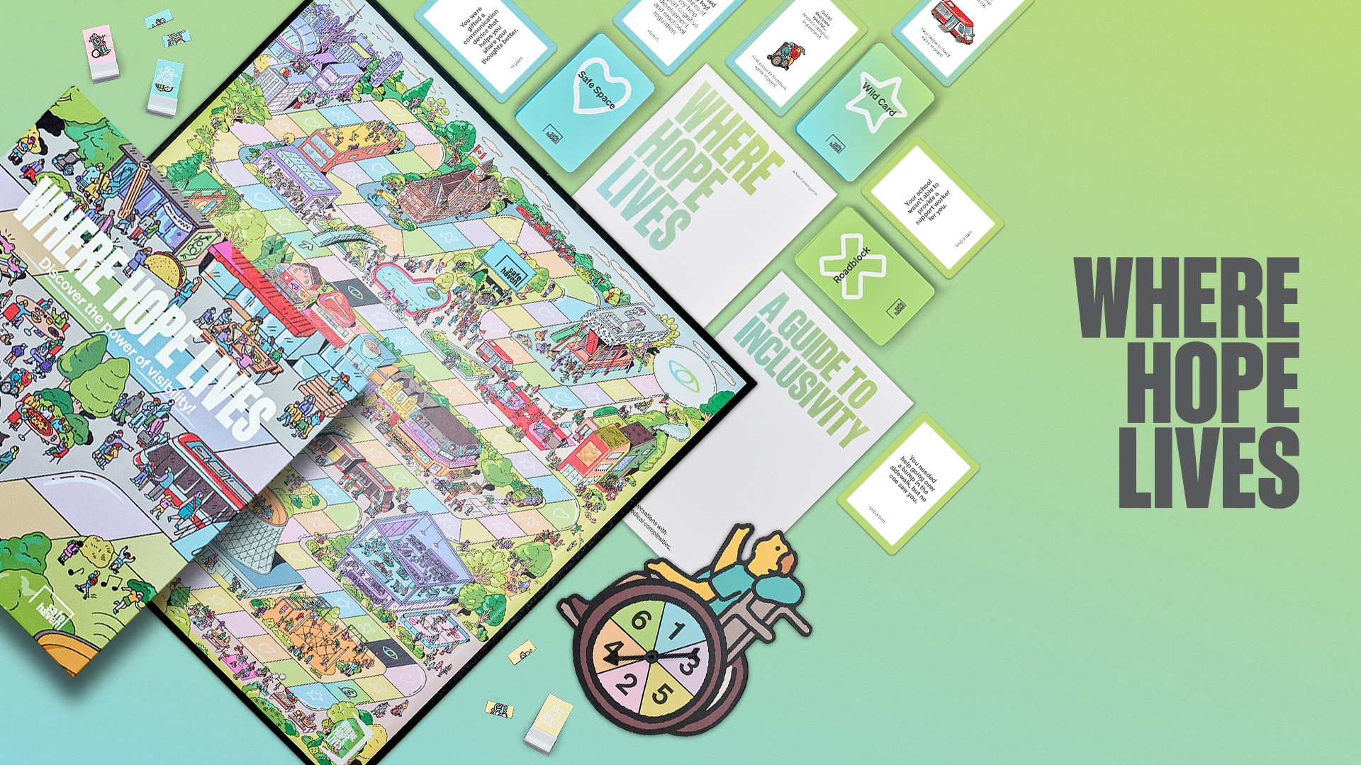
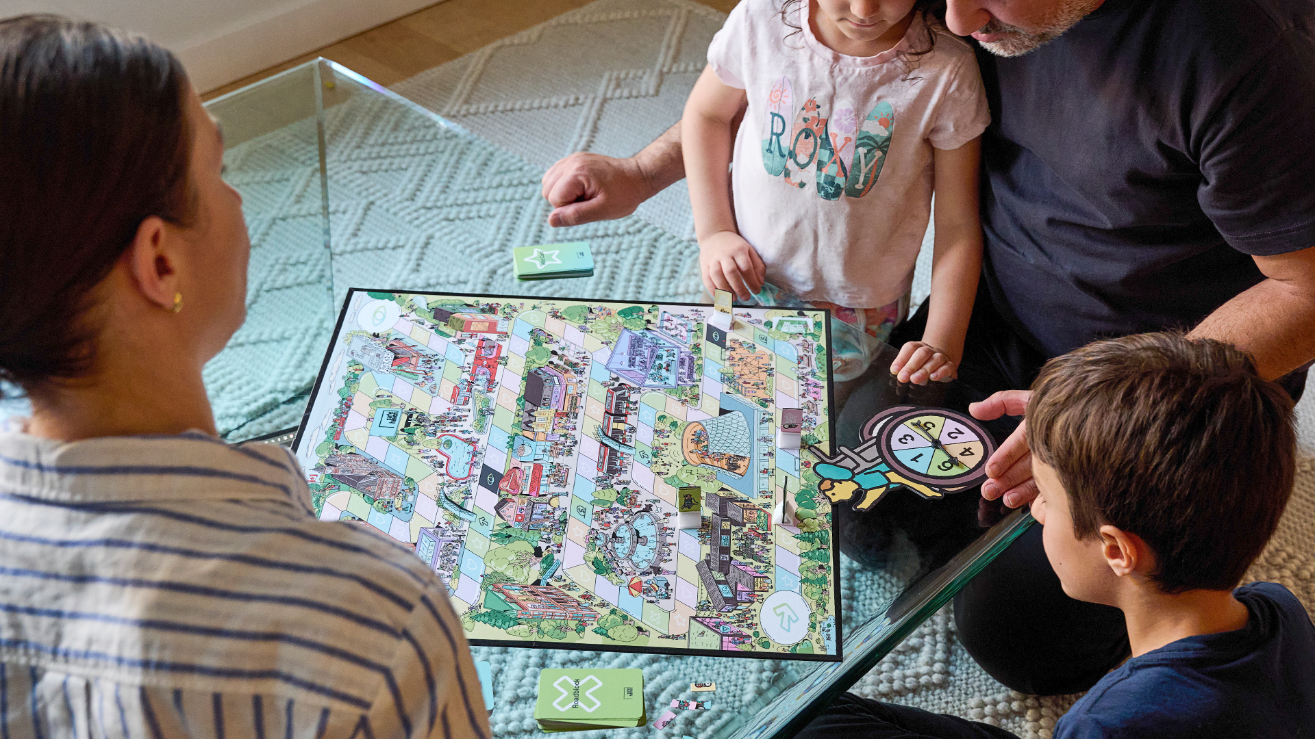
So, they created “Where Hope Lives”, a board game designed for families to play together. The game extended Safehaven’s existing visual identity into a tactile, interactive experience.
The board was hand-illustrated to depict real city landmarks, from the ROM to local parks to the Toronto Blue Jays, so kids could see their city, and themselves, in the world of the game.
The gameplay itself reinforces the core idea. Characters become more visible the further player’s progress. Each trivia question and scenario card are rooted in the real experiences of medically complex children. A companion parent guide provides inclusive language and story-based prompts to make deeper conversation easier. Every element is designed to feel joyful, familiar, and approachable without ever feeling like a lesson.
It was tested with over 50 hours of real family gameplay. It was distributed to influencers, libraries, schools, and summer camps across Toronto. It was also available for purchase online, with proceeds supporting Safehaven programs.
And it worked.
“Where Hope Lives” earned more than 24 million media impressions – eight times the initial Goal – sparked a 252% increase in web traffic and helped drive a 235% year-over-year lift in individual donations. But the real measure of impact was on kitchen tables and family
playrooms, where real families began conversations, they didn’t know how to start. This was design that didn’t just reflect inclusion. This was design as invitation.
Design as action.
Credits
Advertising Agency: The Local Collective, Toronto, CanadaFounder, Chief Creative Officer: Matt Litzinger
Founder, President: Kaitlin Doherty
Executive Creative Director, Design: Omar Morson
Art Director: Siobhan Skene
Copywriter: Tori Bradbrook
Account Director: Vallerie Traitses
Account Executive: Shea McNeely
Illustrator: Kathleen Fu
PR Agency: Heads + Tales
Media Agency: M&K Media