2013 Winners
CLICK BELOW TO SEE THE 2013 AToMiC WINNERS, BY CATEGORY
- AToMiC GRAND PRIX
- AToMiC COLLABORATION
- AToMiC IDEA
- BRAND INTEGRATION
- DIGITAL ENGAGEMENT
- NICHE TARGETING
- TECH BREAKTHROUGH
- AToMiC CSR
- AToMiC ROI
- BROADCAST ENGAGEMENT
- EXPERIENTIAL ENGAGEMENT
- PRINT ENGAGEMENT
- TRANSMEDIA
ATOMIC Grand Prix
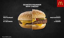
McDonald’s “Our Food. Your Questions.”
Launch:
28 May, 2012
Insight:
McDonald’s has long been confident in the quality of its food, its practices and procedures. However, consistently low food quality scores and a social listening audit revealed that consumers were not as confident.
With some of the lowest food quality perception scores in its category, and with consumers three times less likely to eat there because of it, the challenge was to change the conversation. Canadians have questions about McDonald’s food, and it has answers. But the only way people would start to listen to the food chain is if it started listening to them.
Challenge:
McDonald’s had talked about food quality for years through television and in-store advertising. DDB Canada and Tribal DDB Toronto were challenged to tell the story about McDonald’s food quality in a way that would stop people in their tracks.
So the digital agency created a platform that gave consumers unfettered and unfiltered access to the McDonald’s brand. “Our Food. Your Questions” allowed Canadians to ask McDonald’s any question they had about its food. No question was too tough or raw for McDonald’s to answer. Each question and answer served a myriad of functions: a personal connection to the brand, a sign that McDonald’s was listening, and as a piece of content designed to displace the existing inaccurate or negative information on the web.
This approach to transparency would live or die on its ability to answer every question received and to do so quickly and personally. So the agency created a 10-person response team tasked with answering every question with text, image or video answers – the sum of which became the voice of the platform.
The response team answered some of the biggest questions with videos uploaded to YouTube. At three to five minutes long, the videos were too long to be traditional TV commercials but online allowed McDonald’s to deepen the experience for consumers wanting to learn more about the food they eat. The McDonald’s Canada YouTube page also highlighted the best questions and allowed users to ask their own question right next to campaign videos.
Execution:
Instead of hiding the toughest, most negative questions, the agency did the opposite and put the full weight of McDonald’s media behind it. Real consumer questions became the advertising for the platform and were brought to life with television, online videos, banner ads, wild postings, projections and subway station takeovers. It was a clear signal that McDonald’s was not only listening but ready for a transparent discussion.
Results
In total, McDonald’s received and answered more than 19,000 consumer questions, exceeding the year one target by 400%. The website generated more than 10 million interactions with an average engagement time of more than four minutes. The branded YouTube channel gained more than 13 million views.
Most important, the transparent approach had a noticeable impact on the brand’s food quality scores: an independent study by Environics Research showed that the top three measures for food quality perception improved by 73%, 61% and 48% respectively.
In a final testament to the power of transparency, the brand saw a 46% increase in the metric “company I trust.” The Globe and Mail said it best by calling the platform “A glimpse into the future of marketing – a one-two punch of tradition and technology.”
Credits: Creative Director: Louis-Philippe Tremblay Strategy: Jason Chaney, Kevin McHugh Technology Director: Joe Dee Copywriter: Ryan Lawrence, Ian Mackenzie, Tiffany Chung, Sanya Grujicic Art Director: Benson Ngo, Derek Blais, Kara Wark, Amy French Executive Producer: Neem Baha Managing Director: Andrew McCartney – Managing Director Account Director: Miles Savage
Television (EN/FR) 30: Creative Director: Louis-Philippe Tremblay Copywriter: Ryan Lawrence, Ian Mackenzie, Sanya Grujicic Art Director: Benson Ngo, Derek Blais, Amy French Executive Producer: Neem Baha Agency Producer: Melanie Lambertsen Account Team: Miles Savage – Account Director French Canadian adapt team Account Executive (DDB Canada Montreal): Michelle Aboud Production Company: OPC FamilyStyle Director: Jon Weiman & Torey Kohara Line Producer: Liz Dussault Post-Production Company: School - Various Editor: School - Various Audio House: RNW Talent: Real People (McDonald’s Employees, suppliers)
ONLINE VIDEO: Creative Director: Louis-Philippe Tremblay Copywriter: Ryan Lawrence, Ian Mackenzie, Tiffany Chung, Sanya Grujicic Art Director: Benson Ngo, Derek Blais, Kara Wark, Amy French Executive Producer: Neem Baha Agency Producer: Andrew Shulze, Melanie Lambertsen Account Team: Miles Savage – Account Director Production Company: OPC FamilyStyle Director: John Weiman & Torey Kohara Executive Producer: Harland Weiss, Donovan Boden Line Producer: Liz Dussault Post-Production Company: School - Various Editor: School - Various Audio House: RNW Talent: Real People (McDonald’s Employees, suppliers)
WEBSITE: Creative Director: Louis-Philippe Tremblay Head Designer: Peter Borell Art Director: Derek Blais Copywriter: Ian Mackenzie Designer: Jean Lou Renoux Agency Producer: Neem Baha Account Team: Miles Savage – Account Director Director of Technology: Joe Dee Developers: Paul Jara/Paul Sham Analyst: Kevin McHugh
DIGITIAL ASSETS: Creative Director: Louis-Philippe Tremblay Head Designer: Peter Borell Copywriter: Ian Mackenzie Art Director: Derek Blais Designer: Jean Lou Renoux Account Team: Miles Savage – Account Director Melanie Chiriboga-Gomez – Account Co-Ordinator Digital Producer: Melanie Chiriboga-Gomez
SOCIAL MEDIA: Director of Social Media: Ed Lee Community Manager: Laura Muirhead Response Team Lead: Parker Mason
OUT OF HOME: Creative Director: Louis-Philippe Tremblay Head Designer: Peter Borell Art Director: Benson Ngo, Derek Blais Copywriter: Ryan Lawrence, Ian Mackenzie Designer: Jean Lou Renoux Account Team: Miles Savage – Account Director French Canadian adapt team: Gaetan Namouric – Creative, Michelle Aboud – Account Executive (DDB Canada Montreal) Executive Producer: Neem Baha Producer: Melanie Chiriboga-Gomez Director of Print: Rose-Ella Morrison Studio Artist: Jason Taylor, Jane Davies
Atomic Collaboration
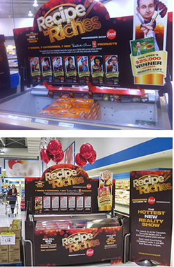
Silver: Recipe to Riches Season Two
Launch date:
October 17, 2012
From Pitch to Concept:
The original pitch for “Recipe to Riches” was basically an “Academy Awards” for food. It included a search for Best Chef, Best Pastry Chef, Best TV Chef, Hottest Newcomer Restaurant, Best Restaurant and Best Hotel Restaurant in Canada. The nominees would be given posters advertising their nomination for the awards. The public and culinary institutions would then vote for the winners online. The show’s executive producer Gerry McKean distilled this concept into its current format to allow a brand to be brought on board and provide a more robust viewing experience for the audience.
Execution:
The show saw non-professional cooks compete for the best recipe within a food category (savory snacks, entrees, dips etc.) and a winner from each episode was chosen. The next day, their recipe was mass produced under Loblaw’s flagship brand, President’s Choice, and made available at Loblaw’s grocery stores nationwide. Viewers were able to truly experience each dish and then cast an informed vote for who they believe should take home the $250,000 grand prize.
Objectives/challenges:
The initial objective was to create an interesting show while balancing the interests of each partner: Food Network, Temple Street Productions Inc. and Loblaw Companies Limited. During execution, the challenge was to time the taping and airing of the show to perfectly align with the products hitting store shelves. This required working extensively with Loblaw and the Food Network to make sure both schedules always aligned. The show had to be filmed eight months in advance to allow for sufficient production lead time for Loblaw’s production teams. Creating mass produced products from scratch was also a challenge.
Impact:
Recipe to Riches gave the President’s Choice brand some of its best-selling products in the last 10 years.
Atomic Collaboration:
Loblaw saw Recipe to Riches as an authentic way to tie quality branded content with their President’s Choice brand. The retailer understood the benefit of integrating its products in an innovative way. The concept and production expertise came from Temple Street Productions Inc. Logistical and product development expertise came from Loblaw Companies Ltd. Loblaw was particularly helpful in assisting the judges with choosing the products that had great potential for the competition.
Recipe to Riches was new territory, particularly for Loblaw, as they had never ventured into television production before. However, despite this unfamiliar territory, Loblaw had (and still has to this day) great confidence in this venture, which was proven to Temple Street when Loblaw agreed to take a financial risk and produce the series. This project is the first of its kind worldwide. The Recipe to Riches format proved to be a symbiotic partnership where both companies broke new ground together. All those involved worked to ensure the format remained strong while delivering the right brand message to promote President’s Choice and the Food Network.
Credits:
TEMPLE STREET PRODUCTIONS: VP, Finance: Amanda Mathieson Managing Director: John Young Head of Development: Jennifer Harkness Factual & Reality Director, Business Affairs: Kelly Jenkins Office Manager: Laura St Amour Director, Production: Robin Reelis VP, Business & Legal Affairs: Samantha Traub Development Coordinator: Veronica Saluzzi Executive Assistant: Beth Iley
FOOD NETWORK: Director of Original Production: Leslie Merklinger Production Executive: Holly Gillanders
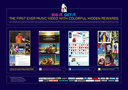
BRONZE: Cheer “Dig It! Get It!”
Cheer is a detergent that has been around for over 50 years, but went through many changes that left it out of touch with consumers, retailers and its “colour care” heritage. Toronto based agency Leo Burnett decided to rescue the brand with a new campaign that targets a new generation of consumers, Millennials.
The objectives: revitalize Cheer's heritage and prove its relevance by acting like a cool brand with a passion for colourful things, people and ideas that break new ground – and ultimately get the product into their hands.
Millennials (18 to 29 year olds, 76 million strong), have never been spoken to by a laundry brand. They couldn't care less about the category; connecting with them requires tapping into their desire to express their unique self – through music, fashion and colour. Also coined as digital natives, Millennials are always-on, highly-connected users of social media and drivers of the tech revolution. Impressing them with a new type of interactive experience was a must.
The agency took an unbranded, influencer approach to get their attention, collaborating with a hot new band, Strange Talk, to create the first-‐ever music video where people could literally click on something colourful in the video to get it. It also partnered with music and entertainment bloggers and websites to tease the launch of the video for two weeks. The content, including band interviews was heavily branded as Strange Talk. The band also personally promoted the launch in their social channels. There was no mention of Cheer during this period, but its colourful new brand cues were everywhere. All promotions drove to a Facebook event page, hosted by the brand, where Millennials RSVP’d to the release of the first-‐ever video experience. Within two weeks, 12,274 Millennials RSVP’d.
On August 15, 2011, all media changed to direct people to the video on Strange Talk’s YouTube channel. For two weeks, people searched the video for hidden colourful rewards, like hoodies, leggings, tops, sunglasses, iPods, even a colourful new bike. It also partnered with YouTube to make use of its beta “annotation” technology to combine multiple social media platforms. When Millennials clicked on the item they wanted, they were directed back to Cheer’s Facebook page, where the brand behind the program was finally revealed. Cheer sent the colourful items to the winners along with a sample of its product and a mantra on its shared passion for all things colourful.
The campaign led to clear lifts in ad awareness (+2.5), message association (+9.0) and purchase intent (+7.2). Engagement exploded with 366,711 YouTube video views and a Facebook fan increase of 47,534 (826%) over just two weeks. Cheer's new followers praised the approach with 22,623 likes and comments, and the brand's content traveled all over the web, garnering over $25,000,000 in earned media. The traffic pushed the video to #1 on Billboard Uncharted and it was listed as one of 2011’s most contagious videos – putting Cheer and Strange Talk on the minds of Millennials across America.
Credits: Chief Creative Officer: Judy John Creative Director: Judy John, Heather Chambers, Lisa Greenberg Group Creative Director: Kelly Zettel, Sam Cerullo Copywriter: Steve Persico Art Director: Anthony Chelvanathan Digital Copywriter: Steve Persico, Kelly Zettel, Jennifer Smith Digital Art Director: Anthony Chelvanathan, Sam Cerullo, Mark Nilsen, Sean Perkins, Eugene Bak Digital Producer: Jacqueline Adediji EVP, Managing Partner: Kim Koster
Group Account Director: Wendy Dixon Account Director: Natasha Dagenais Account Supervisor: Dan Koutoulakis SVP, Planning: Brent Nelsen Planner: Christina Boldt VP Head of Broadcast/Executive Producer: Franca Piacente Director of Creative Technologies: Felix Wardene Associate Director of Project Management: Cimmeron Kirk Director: Radical Friends Editor: Luke Lynch Production Company: Spy Films The Band: Strange Talk

SILVER: MTV and Sony Xperia “Made of Imagination”
Launch date:
July 9
Objectives and challenges
Influence with scale was taken into consideration when developing the Sony Xperia ION campaign. The brand wanted to connect with key influencers in an authentic manner, while achieving necessary scale for a major product launch, as well as incorporate Sony Mobile’s global “Made of Imagination” campaign platform, along with brand attributes “Play, Watch, Listen, Create.” It also wanted to demonstrate priority product capabilities into execution.
Strategy
Sony connected with MTV Canada – the gold standard in youth and music entertainment – and Free Agency, a branded digital entertainment studio powered by a network of creators and influencers. Together, the collaboration turned Sony’s global “Made of Imagination” into a credible branded web series.
“Made of Imagination” became a pop-up blog and web video series on MTV.ca, documenting artists such as The Sheepdogs, Rich Aucoin, and Hey Ocean in creative musical performances, shot with the Xperia ion’s HD video camera. The blog was curated by creativity site Boooooom.com to establish legitimacy, and drive influencer traffic.
The collaboration enabled Sony to benefit from incremental editorial promotional value, access credible musical artists without endorsement investments, and integrate their product and brand into social video that achieved hundreds of thousands of video impressions across the social web.
Execution
Four 30-second TV promo spots featured campaign artists, driving audiences to the campaign site. The spots were co-branded with MTV and aired on MTV and MuchMusic.
There were also branded episodes of “Made of Imagination”, three to four minutes in length. Each episode featured brand and device integration in the top and tail of the videos, as well as product integration throughout episodes. “Made of Imagination” pop-up blog featured daily posts, curated by global arts blog Boooooooom.com. Regular schedule of the blog posts featured Sony device integration (e.g. behind the scenes play by play of production team using the phones in the performance videos)
Four 30-second pre-roll ads with companion display on MTV and MuchMusic sites drove users to the site and all episodes simultaneously premiered on Booooooom.com, extending reach beyond Much MTV audience. There was extensive editorial promotion on MTV and Booooooom sites, with continuous main page presence for eight weeks.
The social media component included continuous promotion on MTV and Booooooom Twitter and Facebook accounts, and video episodes were seeded to dozens of music, lifestyle, and tech blogs.
Results
In total, the eight-week campaign delivered over 11 million campaign impressions, 560,000 earned video impressions, 29% of visitors returned to the Made of Imagination site during the campaign and 60-plus sites embedded the episodes, including Urban Outfitters, Hypebeast, CNET, and participating band sites.
Credits:
Sony Mobile Communications: Marketing: Farhad Esmail
PHD: Digital Account Director: Jonathan Pretty Account Supervisor: Liana Tamulaitis Media Assistant: Cassi Jamieson
Bell Media: Director of Brand Partnerships: Dave Caporicci Manager, Brand Partnerships: Catherine Halliday Coordinator, Brand Partnerships: Ashley Rodrigues, Creative Director, MTV: Ian Whittaker Director of Digital, MTV: Mark Swierszcz
Free Agency: Principal: Chris Unwin
AToMiC Idea:

Silver: Carly’s Café
Date of Launch:
May 24th, 2012
Objective/Challenge:
Carly Fleischmann is a 17-year-old teen living with non-verbal Autism (she can’t speak). Carly wanted to let people know what it’s like to live in the mysterious and often misunderstood world of Autism. And while she helped co-author a book (Carly’s Voice) that allowed people to read about what it’s like to have Autism, she wanted to help people experience what it’s like.
Insight:
For Carly, and many Autistic people, the experience of Autism is intensely frustrating. They think and feel as we all do, but they can’t communicate their feelings. In Carly’s case, her outward self is a mixture of load moans and by our standards “odd” and repetitive behavior. Inside, however, was a bright, sarcastic, intelligent 17-year-old girl.
Toronto ad agency John St. came up with the idea to create a site that mimicked the frustration and helplessness that she (and others) felt.
Execution:
When you create a website, you usually try to make it as user-friendly as possible. But the goal was to show users what it’s like living with Autism, so John St. decided to be user-unfriendly. Since Autism inhibits “normal” social interaction, as users interacted with the site it slowly inhibited their control – mimicking the loss of control and focus Carly describes in her book. By using this extra dimension of participation, combined with an already powerful story of a young woman unable to communicate with her family (or simply get a coffee), the site created an overwhelming, emotional experience that would lead people to want to learn more about Carly’s story.
Results:
After the site launched, it was featured on top creativity blogs such as Fast Company and The FWA. Carly received hundreds of messages from around the world and over 50,000 hits on the site (with the average stay over two minutes), many from parents of Autistic children, who felt they now understood the condition better. Additionally, the site was shared by the President of Poland at the UN Convention on the Rights of People with Disabilities - helping to further reduce the stigma and dehumanization towards people living with Autism worldwide.
Credits: Agency: John st. Creative Directors: Angus Tucker, Stephen Jurisic Copywriter: Kelly Uman Art Director: Marie Richer Producer: Ryan O’Hagan Technologist: Marc Cattapan Interactive: Heung Lee, Ransom, Profit Production Company: OPC Director: Miles Jay Executive Producer: Harland Weiss Executive Producer: Donovan Boden Line Producer: Dennis Beier Director of Photography: Chris Mably Editor: Chris Murphy, Relish VFX Artist: Sean Cochrane, The Vanity Audio Director: Stephanie Pigott, Pirate Phantom Tech: Brent J. Craig Colourist: Wade Odlum Composer: Rob Simonsen Casting: Michael Stephenson Logo Design: Jan Avendano
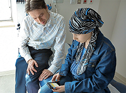
Gold: SickKids Pain Squad App
Every year at Toronto’s Hospital for Sick Children (SickKids), thousands of children are treated for cancer. Pain is the worst part for these patients. The hospital is continually working on innovative ways to manage and minimize the pain experienced during treatment. To help them do this they need their patients to record exactly how they are feeling on a daily basis. However, after multiple surgeries, chemotherapy and radiation treatment, many of these children are too tired or discouraged to keep detailed reports. Unless this data is collected consistently, it is worthless to the hospital.
As a result SickKids approached Toronto agency Cundari to help find a creative solution to consistently collect pain data. And with that, the Pain Squad mobile app was born. The agency gave each recruit an Apple iPhone loaded with the Pain Squad app. Twice a day, patients were given an alert from “Headquarters,” telling them that it is time to complete their pain reporting mission. Because the reports worked with iPhone’s user-friendly touch screen, kids could easily fill them out. With a simple flick of the finger, they could easily identify exactly where and how much it hurt as well as which medications were working best.
Making it “easy” was simple. But to truly be successful, there needed to be a way to encourage the young target to do this on a daily basis. So the agency called in some special police reinforcements. It brought together the casts of Canada’s top police dramas, Flashpoint and Rookie Blue, and filmed a series of inspiring videos that were incorporated in the App.
Just like a regular police force, the recruits were challenged to work their way up the ranks. Every time the patients completed 3 reports in a row they received a video from one of our actors informing them that they were receiving an award or being promoted to a new rank. Then once the recruit’s last report was filed, they were sent one final message from police headquarters informing them that they were being retired from the field.
Rather than viewing their pain journal as a chore, children looked forward to completing it. Since its launch, the completion rate for reports has been over 90% – an unheard of compliance rate in pediatric medicine. And for the first time ever, the information being given is coming from the patient themselves. As a result, SickKids is receiving pain data that it can actually use to help current and future patients.
Due to this success, the Pain Squad Mobile App is now being used in three other Canadian pediatric hospitals, and will soon be made available in the Apple App Store so that kids with cancer all over the world will have an opportunity to take control of their pain.
Credits: Client: The Hospital for Sick Children Agency: Cundari Chief Creative Officer: Brent Choi Group Creative Director / Copywriter: Cory Eisentraut Group Creative Director / Art Director: Mike Sipley Interactive Designer: Stuart Thom Account Lead: Mike Orr, Carol-Ann Granatstein Producer: Carol-Ann Granatstein Music/Sound: Ed Zych Developers: Patrick Lee, Jin Kim, Ali Asim, Wayne Gomes (CTO) DOP: Rob Dutchin, Kawal Singh Editor: Cherie O’Connor
Gold: McDonald’s “Our Food. Your Questions.”
Launch:
28 May, 2012
Insight:
McDonald’s has long been confident in the quality of its food, its practices and procedures. However, consistently low food quality scores and a social listening audit revealed that consumers were not as confident.
With some of the lowest food quality perception scores in its category, and with consumers three times less likely to eat there because of it, the challenge was to change the conversation.
Canadians have questions about McDonald’s food, and it has answers. But the only way people would start to listen to the food chain is if it started listening to them.
Challenge:
McDonald’s had talked about food quality for years through television and in-store advertising. DDB Canada and Tribal DDB Toronto were challenged to tell the story about McDonald’s food quality in a way that would stop people in their tracks.
So the digital agency created a platform that gave consumers unfettered and unfiltered access to the McDonald’s brand. “Our Food. Your Questions” allowed Canadians to ask McDonald’s any question they had about its food. No question was too tough or raw for McDonald’s to answer. Each question and answer served a myriad of functions: a personal connection to the brand, a sign that McDonald’s was listening, and as a piece of content designed to displace the existing inaccurate or negative information on the web.The agency knew this approach to transparency would live or die on its ability to answer every question received and to do so quickly and personally. So it created a 10-person response team tasked with answering every question with text, image or video answers – the sum of which became the voice of the platform.
The response team answered some of the biggest questions with videos uploaded to YouTube. At three to five minutes long, the videos were too long to be traditional TV commercials but online allowed McDonald’s to deepen the experience for consumers wanting to learn more about the food they eat. The McDonald’s Canada YouTube page also highlighted the best questions and allowed users to ask their own question right next to campaign videos.
Execution:
Instead of hiding the toughest, most negative questions, the agency did the opposite and put the full weight of McDonald’s media behind it. Real consumer questions became the advertising for the platform and were brought to life with television, online videos, banner ads, wild postings, projections and subway station takeovers. It was a clear signal that McDonald’s was not only listening but ready for a transparent discussion.
Results:
In total, McDonald’s received and answered more than 19,000 consumer questions, exceeding the year one target by 400%. The website generated more than 10 million interactions with an average engagement time of more than four minutes. The branded YouTube channel gained more than 13 million views.
Most important, the transparent approach had a noticeable impact on the brand’s food quality scores: an independent study by Environics Research showed that the top three measures for food quality perception improved by 73%, 61% and 48% respectively.
In a final testament to the power of transparency, the brand saw a 46% increase in the metric “company I trust.” The Globe and Mail said it best by calling the platform “A glimpse into the future of marketing – a one-two punch of tradition and technology.”
Credits: Creative Director: Louis-Philippe Tremblay Strategy: Jason Chaney, Kevin McHugh Technology Director: Joe Dee Copywriter: Ryan Lawrence, Ian Mackenzie, Tiffany Chung, Sanya Grujicic Art Director: Benson Ngo, Derek Blais, Kara Wark, Amy French Executive Producer: Neem Baha Managing Director: Andrew McCartney – Managing Director Account Director: Miles Savage
Television (EN/FR) 30: Creative Director: Louis-Philippe Tremblay Copywriter: Ryan Lawrence, Ian Mackenzie, Sanya Grujicic Art Director: Benson Ngo, Derek Blais, Amy French Executive Producer: Neem Baha Agency Producer: Melanie Lambertsen Account Team: Miles Savage – Account Director French Canadian adapt team Account Executive (DDB Canada Montreal): Michelle Aboud Production Company: OPC FamilyStyle Director: Jon Weiman & Torey Kohara Line Producer: Liz Dussault Post-Production Company: School - Various Editor: School - Various Audio House: RNW Talent: Real People (McDonald’s Employees, suppliers)
ONLINE VIDEO: Creative Director: Louis-Philippe Tremblay Copywriter: Ryan Lawrence, Ian Mackenzie, Tiffany Chung, Sanya Grujicic Art Director: Benson Ngo, Derek Blais, Kara Wark, Amy French Executive Producer: Neem Baha Agency Producer: Andrew Shulze, Melanie Lambertsen Account Team: Miles Savage – Account Director Production Company: OPC FamilyStyle Director: John Weiman & Torey Kohara Executive Producer: Harland Weiss, Donovan Boden Line Producer: Liz Dussault Post-Production Company: School - Various Editor: School - Various Audio House: RNW Talent: Real People (McDonald’s Employees, suppliers)
WEBSITE: Creative Director: Louis-Philippe Tremblay Head Designer: Peter Borell Art Director: Derek Blais Copywriter: Ian Mackenzie Designer: Jean Lou Renoux Agency Producer: Neem Baha Account Team: Miles Savage – Account Director Director of Technology: Joe Dee Developers: Paul Jara/Paul Sham Analyst: Kevin McHugh
DIGITIAL ASSETS: Creative Director: Louis-Philippe Tremblay Head Designer: Peter Borell Copywriter: Ian Mackenzie Art Director: Derek Blais Designer: Jean Lou Renoux Account Team: Miles Savage – Account Director Melanie Chiriboga-Gomez – Account Co-Ordinator Digital Producer: Melanie Chiriboga-Gomez
SOCIAL MEDIA: Director of Social Media: Ed Lee Community Manager: Laura Muirhead Response Team Lead: Parker Mason
OUT OF HOME: Creative Director: Louis-Philippe Tremblay Head Designer: Peter Borell Art Director: Benson Ngo, Derek Blais Copywriter: Ryan Lawrence, Ian Mackenzie Designer: Jean Lou Renoux Account Team: Miles Savage – Account Director French Canadian adapt team: Gaetan Namouric – Creative, Michelle Aboud – Account Executive (DDB Canada Montreal) Executive Producer: Neem Baha Producer: Melanie Chiriboga-Gomez Director of Print: Rose-Ella Morrison Studio Artist: Jason Taylor, Jane Davies
Silver: Stanfield’s Gitchhiker
Date of Launch:
November 14, 2012
Objective/Challenge:
Stanfield’s is a small Canadian underwear company that’s been around for 150 years. With very little to no advertising support in the last 20 years, most young men see it as their Dad’s underwear brand (or worse – their Grandad’s). It needed to find a way to become relevant to a younger audience and show that Stanfield’s is the ultimate Canadian underwear – all on a very limited ($200K all in) budget.
Insight:
To prove Stanfield’s underwear is the Canadian underwear brand, agency John St. challenged one man to hitchhike across the country, in the dead of winter, wearing nothing but Stanfield’s underwear. If he made it within 21 days, the brand would donate $20,000 to support men’s below-the-waist cancer research – which fit perfectly with Stanfield’s motto, “We Support Men.” The brand needed a better name than Hitchhiker. So, the agency took a popular slang term for underwear and thus, the “Gitchhiker” was born.
Execution:
Stanfield’s partnered with the Canadian Cancer Society, and found an eager testicular cancer survivor to be its hitchhiker. His job was to raise awareness and support, handing out free ‘thumbs-up’ underwear as he went. Next, the agency developed a Facebook app (GitchHiker.com) where fans could follow every aspect of his journey, including his current location, what the temperature was and what underwear he was wearing. They could also help him out with daily gifts, dares or even sign up to give him a ride – which they did without hesitation. The Gitchhiker was given complete social media control of the brand’s Facebook and Twitter accounts – posting pics, videos and even pleas for help when he couldn’t find a ride.
Results:
Turns out, growing a moustache isn’t the only way to get attention in November. In just 21 days, and with no paid advertising, the campaign generated over 43 million media impressions. The Gitchhiker himself completed 64 separate interviews on various television and radio programs, including several three minute-plus segments on CBC and CTV national news. What’s more, underwear sales increased by 50% during the campaign and Facebook fans increased by 500%.
The Gitchhiker also collected thousands of dollars in donations along the way, which – combined with Stanfield’s donation – garnered a total of $32,398 for the Canadian Cancer Society.
Credits: Agency: John St. Client: Stanfield’s Creative Directors: Angus Tucker, Stephen Jurisic, Nellie Kim, Chris Hirsch Writer: Kurt Mills Art Director: Kyle Lamb Producer: Ryan Bourret Account Service: Andrew Godfrey, Melissa Tobenstein, Joelle Woodruff Online Design/Production: Secret Location Production Company: Secret Location Exec Producer: James Milward Producer: Ashlee Lougheed Creative Director: Pietro Gagliano Art Director: Stefan Grambart Designer: Kai Salminen Technical Director: Ryan Andal Developers: Paul Stodolak, Adam Drake Coordinator: Adam Park Chase Producer: Nick Matthews Shooter & Editor: Stephen Dagg Assistant Editor: Michael Kazanowski Editing/Online House: Relish Executive Producer Relish: Sally Leggett Editor: Chris Murphy Assistant Editor: Michael Barker The Gitchhiker: Mark McIntyre
Best Brand Integration
Bronze: Stanfield’s Gitchhiker
Date of Launch:
November 14, 2012
Objective/Challenge:
Stanfield’s is a small Canadian underwear company that’s been around for 150 years. With very little to no advertising support in the last 20 years, most young men see it as their Dad’s underwear brand (or worse – their Grandad’s). It needed to find a way to become relevant to a younger audience and show that Stanfield’s is the ultimate Canadian underwear – all on a very limited ($200K all in) budget.
Insight:
To prove Stanfield’s underwear is the Canadian underwear brand, agency John St. challenged one man to hitchhike across the country, in the dead of winter, wearing nothing but Stanfield’s underwear. If he made it within 21 days, the brand would donate $20,000 to support men’s below-the-waist cancer research – which fit perfectly with Stanfield’s motto, “We Support Men.” The brand needed a better name than Hitchhiker. So, the agency took a popular slang term for underwear and thus, the “Gitchhiker” was born.
Execution:
Stanfield’s partnered with the Canadian Cancer Society, and found an eager testicular cancer survivor to be its hitchhiker. His job was to raise awareness and support, handing out free ‘thumbs-up’ underwear as he went. Next, the agency developed a Facebook app (GitchHiker.com) where fans could follow every aspect of his journey, including his current location, what the temperature was and what underwear he was wearing. They could also help him out with daily gifts, dares or even sign up to give him a ride – which they did without hesitation. The Gitchhiker was given complete social media control of the brand’s Facebook and Twitter accounts – posting pics, videos and even pleas for help when he couldn’t find a ride.
Results:
Turns out, growing a moustache isn’t the only way to get attention in November. In just 21 days, and with no paid advertising, the campaign generated over 43 million media impressions. The Gitchhiker himself completed 64 separate interviews on various television and radio programs, including several three minute-plus segments on CBC and CTV national news. What’s more, underwear sales increased by 50% during the campaign and Facebook fans increased by 500%.
The Gitchhiker also collected thousands of dollars in donations along the way, which – combined with Stanfield’s donation – garnered a total of $32,398 for the Canadian Cancer Society.
Credits: Agency: John St. Client: Stanfield’s Creative Directors: Angus Tucker, Stephen Jurisic, Nellie Kim, Chris Hirsch Writer: Kurt Mills Art Director: Kyle Lamb Producer: Ryan Bourret Account Service: Andrew Godfrey, Melissa Tobenstein, Joelle Woodruff Online Design/Production: Secret Location Production Company: Secret Location Exec Producer: James Milward Producer: Ashlee Lougheed Creative Director: Pietro Gagliano Art Director: Stefan Grambart Designer: Kai Salminen Technical Director: Ryan Andal Developers: Paul Stodolak, Adam Drake Coordinator: Adam Park Chase Producer: Nick Matthews Shooter & Editor: Stephen Dagg Assistant Editor: Michael Kazanowski Editing/Online House: Relish Executive Producer Relish: Sally Leggett Editor: Chris Murphy Assistant Editor: Michael Barker The Gitchhiker: Mark McIntyre
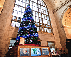
Bronze: Canadian Tire Christmas Spirit Tree
Although Canadian Tire had enjoyed #1 market share over the Christmas holiday period, the retailer’s dominance in the Christmas outdoor lighting and seasonal décor categories had been on the decline due to fierce competition. For the 2011 Christmas season, Canadian Tire needed a campaign to defend its position, reclaim Christmas and re-energize holiday spirit, while reminding the nation that Canadian Tire is Canada’s go-to Christmas Store.
More Canadians were using digital and social channels to spread their ‘best wishes’ during the Christmas season. A Canadian Tire commissioned survey revealed that 37% of Canadians would not mail Christmas cards in 2011, but rather use online channels. Twenty eight percent said they would share Christmas spirit via social media networks; an increase in the 1.6 million messages shared across the country in 2010. This showed that Christmas spirit in Canada was alive and well, but it was being expressed and shared in a different medium: online. To leverage the nation’s collective digital Christmas spirit and consumer engagement, Canadian Tire launched (with the help of agency DDB Toronto) a first of its kind: a 30-foot tall “Christmas Spirit Tree” equipped with 3,000 individually programmed LED lights in Toronto’s Union Station between December 10 and 31, 2011.Using Sysomos’ social media monitoring software, Canadian blogs, forums, social networks and news sites were scoured for posts and messages containing a variety of Christmas keywords. Then, using proprietary lighting software, those messages were transformed into data that were used to boost the colour and intensity of lights on the tree. As Canada’s online spirit grew stronger, the lights on the tree shone brighter.
To extend the reach, the tree was streamed live at Christmasspirittree.ca and on digital billboards. The Spirit Tree leveraged Rogers LTE just weeks after it came to market and used it to power the high bandwidth live stream and the speed of the LTE technology provided near real-time response to users interacting with the tree.
Canadians were also invited to share their Christmas messages via mobile and web where a series of special light displays would magically light up the tree in real-time. Through the Christmas Spirit Tree, Canadian Tire was able to increase foot traffic to its stores, resulting in an increase of $500,000 in local store revenue, specifically from the coupons distributed to viewers of the tree.
The paid online media delivered over 20 million earned impressions across Canada, with visitors from over 170 countries arriving at Christmasspirittree.ca. In the two weeks the tree was live, visitors spent an average of seven minutes on the site, and were engaged for over 1.84 million minutes while viewing the live stream.
Canadian Tire’s overall social presence increased, with over 660 blog mentions, 780 news mentions, 2,600 tweets and 2,200 forum posts about the brand. Canadian Tire successfully defended its #1 market share for the 2011 Christmas season, with the incremental foot traffic driving sales. In addition, the retailer developed new relationships with customers by using innovative technology and social connectivity to reignite the Christmas Spirit among Canadians.
Credits: Creative Director: LP Tremblay Associate Creative Director: Mara Binudin Writer: Ryan Lawrence Technical Director: Joe Dee Interactive Developer: Paul Sham Senior Consultant, DDB Public Relations: Greg Vallentin Business Unit Director: Kaezad Nallaseth Designer: Roger Dario AVP of Digital Marketing and Gift Cards: Rosie Riolino-Serpa Digital Marketing and Merchandising Manager: Andrew Natale Social Media Manager: Stephanie Abouatallah
Gold: SickKids Pain Squad App
Every year at Toronto’s Hospital for Sick Children (SickKids), thousands of children are treated for cancer. Pain is the worst part for these patients. The hospital is continually working on innovative ways to manage and minimize the pain experienced during treatment. To help them do this they need their patients to record exactly how they are feeling on a daily basis. However, after multiple surgeries, chemotherapy and radiation treatment, many of these children are too tired or discouraged to keep detailed reports. Unless this data is collected consistently, it is worthless to the hospital.
As a result SickKids approached Toronto agency Cundari to help find a creative solution to consistently collect pain data. And with that, the Pain Squad mobile app was born. The agency gave each recruit an Apple iPhone loaded with the Pain Squad app. Twice a day, patients were given an alert from “Headquarters,” telling them that it is time to complete their pain reporting mission. Because the reports worked with iPhone’s user-friendly touch screen, kids could easily fill them out. With a simple flick of the finger, they could easily identify exactly where and how much it hurt as well as which medications were working best.
Making it “easy” was simple. But to truly be successful, there needed to be a way to encourage the young target to do this on a daily basis. So the agency called in some special police reinforcements. It brought together the casts of Canada’s top police dramas, Flashpoint and Rookie Blue, and filmed a series of inspiring videos that were incorporated in the App.
Just like a regular police force, the recruits were challenged to work their way up the ranks. Every time the patients completed 3 reports in a row they received a video from one of our actors informing them that they were receiving an award or being promoted to a new rank. Then once the recruit’s last report was filed, they were sent one final message from police headquarters informing them that they were being retired from the field.
Rather than viewing their pain journal as a chore, children looked forward to completing it. Since its launch, the completion rate for reports has been over 90% – an unheard of compliance rate in pediatric medicine. And for the first time ever, the information being given is coming from the patient themselves. As a result, SickKids is receiving pain data that it can actually use to help current and future patients.
Due to this success, the Pain Squad Mobile App is now being used in three other Canadian pediatric hospitals, and will soon be made available in the Apple App Store so that kids with cancer all over the world will have an opportunity to take control of their pain.
Credits: Client: The Hospital for Sick Children Agency: Cundari Chief Creative Officer: Brent Choi Group Creative Director / Copywriter: Cory Eisentraut Group Creative Director / Art Director: Mike Sipley Interactive Designer: Stuart Thom Account Lead: Mike Orr, Carol-Ann Granatstein Producer: Carol-Ann Granatstein Music/Sound: Ed Zych Developers: Patrick Lee, Jin Kim, Ali Asim, Wayne Gomes (CTO) DOP: Rob Dutchin, Kawal Singh Editor: Cherie O’Connor
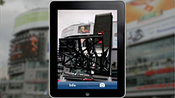
Bronze: Volkswagen “The Beetle Juiced Up”
The Beetle Juiced Up campaign launched on September 26,, 2011. Volkswagen’s business objective was to drive awareness and sales for the Canadian launch of the completely redesigned 2012 Beetle. In doing so, it was important to increase the Beetle’s appeal to men (without alienating the vehicle’s predominantly female customer base) by reinforcing the more aggressive and performance-oriented redesign of the iconic Volkswagen Beetle.
To shape the campaign strategy, the brand and its agency Red Urban looked both to the lifestyle of the target and the character of the car. Firstly, the target consumers are active urbanites who spend time out and about exploring their cities, so OOH was a primary media choice. Secondly, because the design of the latest incarnation of the Beetle looks both to the past as well as the future – the brand wanted the advertising to do the same, putting a modern twist on traditional outdoor media.
This innovative approach to traditional media brought the strategy to life and reinforced the redesign of the Beetle as an innovative, modern twist on the car’s iconic design. This “twist” appealed to the target consumer. OOH advertising, launched in major markets across Canada, contained augmented reality markers that allowed people to use their smartphones to enhance their experience of the OOH ads, and experience the Beetle in aggressive, performance-oriented situations.
The activation proved captivating, motivating, and unique for the psychographic profile of the target market. Also worth noting is that the experience was available online through YouTube videos that made it possible to experience the AR at home.
The campaign stood out because it was placed in areas that the target frequented, and spoke to them in a way that was appealing. The approach resulted in 83% of Volkswagen’s total inventory of Beetles sold within the first month. The performance of the vehicle was successfully communicated to audiences via the AR app, with an 820% increase in app downloads on the day of the Beetle event and a continued increase over the three days that followed. The launch also triggered 3,537,513 unique visits to vw.ca –
the most day visits in 2011. And in three months, it garnered 148,899,213 online impressions: the highest number of total impressions in the history of Volkswagen Canada.
Silver: McDonald’s “Our Food. Your Questions.”
Launch:
28 May, 2012
Insight:
McDonald’s has long been confident in the quality of its food, its practices and procedures. However, consistently low food quality scores and a social listening audit revealed that consumers were not as confident.
With some of the lowest food quality perception scores in its category, and with consumers three times less likely to eat there because of it, the challenge was to change the conversation.
Canadians have questions about McDonald’s food, and it has answers. But the only way people would start to listen to the food chain is if it started listening to them.
Challenge:
McDonald’s had talked about food quality for years through television and in-store advertising. DDB Canada and Tribal DDB Toronto were challenged to tell the story about McDonald’s food quality in a way that would stop people in their tracks.
So the digital agency created a platform that gave consumers unfettered and unfiltered access to the McDonald’s brand. “Our Food. Your Questions” allowed Canadians to ask McDonald’s any question they had about its food. No question was too tough or raw for McDonald’s to answer. Each question and answer served a myriad of functions: a personal connection to the brand, a sign that McDonald’s was listening, and as a piece of content designed to displace the existing inaccurate or negative information on the web.
This approach to transparency would live or die on its ability to answer every question received and to do so quickly and personally. So the agency created a 10-person response team tasked with answering every question with text, image or video answers – the sum of which became the voice of the platform.
The response team answered some of the biggest questions with videos uploaded to YouTube. At three to five minutes long, the videos were too long to be traditional TV commercials but online allowed McDonald’s to deepen the experience for consumers wanting to learn more about the food they eat. The McDonald’s Canada YouTube page also highlighted the best questions and allowed users to ask their own question right next to campaign videos.
Execution:
Instead of hiding the toughest, most negative questions, the agency did the opposite and put the full weight of McDonald’s media behind it. Real consumer questions became the advertising for the platform and were brought to life with television, online videos, banner ads, wild postings, projections and subway station takeovers. It was a clear signal that McDonald’s was not only listening but ready for a transparent discussion.
Results
In total, McDonald’s received and answered more than 19,000 consumer questions, exceeding the year one target by 400%. The website generated more than 10 million interactions with an average engagement time of more than four minutes. The branded YouTube channel gained more than 13 million views.
Most important, the transparent approach had a noticeable impact on the brand’s food quality scores: an independent study by Environics Research showed that the top three measures for food quality perception improved by 73%, 61% and 48% respectively.
In a final testament to the power of transparency, the brand saw a 46% increase in the metric “company I trust.” The Globe and Mail said it best by calling the platform “A glimpse into the future of marketing – a one-two punch of tradition and technology.”
Credits: Creative Director: Louis-Philippe Tremblay Strategy: Jason Chaney, Kevin McHugh Technology Director: Joe Dee Copywriter: Ryan Lawrence, Ian Mackenzie, Tiffany Chung, Sanya Grujicic Art Director: Benson Ngo, Derek Blais, Kara Wark, Amy French Executive Producer: Neem Baha Managing Director: Andrew McCartney – Managing Director Account Director: Miles Savage
Television (EN/FR) 30: Creative Director: Louis-Philippe Tremblay Copywriter: Ryan Lawrence, Ian Mackenzie, Sanya Grujicic Art Director: Benson Ngo, Derek Blais, Amy French Executive Producer: Neem Baha Agency Producer: Melanie Lambertsen Account Team: Miles Savage – Account Director French Canadian adapt team Account Executive (DDB Canada Montreal): Michelle Aboud Production Company: OPC FamilyStyle Director: Jon Weiman & Torey Kohara Line Producer: Liz Dussault Post-Production Company: School - Various Editor: School - Various Audio House: RNW Talent: Real People (McDonald’s Employees, suppliers)
ONLINE VIDEO: Creative Director: Louis-Philippe Tremblay Copywriter: Ryan Lawrence, Ian Mackenzie, Tiffany Chung, Sanya Grujicic Art Director: Benson Ngo, Derek Blais, Kara Wark, Amy French Executive Producer: Neem Baha Agency Producer: Andrew Shulze, Melanie Lambertsen Account Team: Miles Savage – Account Director Production Company: OPC FamilyStyle Director: John Weiman & Torey Kohara Executive Producer: Harland Weiss, Donovan Boden Line Producer: Liz Dussault Post-Production Company: School - Various Editor: School - Various Audio House: RNW Talent: Real People (McDonald’s Employees, suppliers)
WEBSITE: Creative Director: Louis-Philippe Tremblay Head Designer: Peter Borell Art Director: Derek Blais Copywriter: Ian Mackenzie Designer: Jean Lou Renoux Agency Producer: Neem Baha Account Team: Miles Savage – Account Director Director of Technology: Joe Dee Developers: Paul Jara/Paul Sham Analyst: Kevin McHugh
DIGITIAL ASSETS: Creative Director: Louis-Philippe Tremblay Head Designer: Peter Borell Copywriter: Ian Mackenzie Art Director: Derek Blais Designer: Jean Lou Renoux Account Team: Miles Savage – Account Director Melanie Chiriboga-Gomez – Account Co-Ordinator Digital Producer: Melanie Chiriboga-Gomez
SOCIAL MEDIA: Director of Social Media: Ed Lee Community Manager: Laura Muirhead Response Team Lead: Parker Mason
OUT OF HOME: Creative Director: Louis-Philippe Tremblay Head Designer: Peter Borell Art Director: Benson Ngo, Derek Blais Copywriter: Ryan Lawrence, Ian Mackenzie Designer: Jean Lou Renoux Account Team: Miles Savage – Account Director French Canadian adapt team: Gaetan Namouric – Creative, Michelle Aboud – Account Executive (DDB Canada Montreal) Executive Producer: Neem Baha Producer: Melanie Chiriboga-Gomez Director of Print: Rose-Ella Morrison Studio Artist: Jason Taylor, Jane Davies
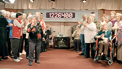
Bronze: WWF National Sweater Day “Granny Call Centre”
Date of Launch – January 31st, 2012
Objective/Challenge:
In 2011, WWF launched National Sweater Day – a day when they asked Canadians to lower their heat and wear a tacky sweater to show support for energy conservation. While most people were genuinely interested in the initiative, many simply forgot by the time the day arrived, and participation was lower than expected.
So for its second year, WWF wanted Sweater Day to reach “Earth Hour” status with a simple idea that would promote countrywide participation, and guarantee people wouldn’t forget. And since they couldn’t afford a traditional media plan, the idea had to be easy (that is: cheap) to execute.
Insight:
Where do Canadians get all their warm, cozy (and tacky) sweaters from? The answer was obvious: their Grannies. Grannies have been trying to get grandkids into sweaters for as long as we can remember – just look at the presents that arrive in the mail every birthday or holiday. So what better way to encourage participation in Sweater Day than with a reminder from a Granny?
Execution:
Many campaigns claim they started a conversation with their customers. But how many can actually say they called and spoke to them personally? To remind people about National Sweater Day, WWF worked with Toronto ad agency John St. to launch “The Granny Call Centre” – where people could sign up to get a reminder call from the Granny of their choice. Users could choose from a wide selection of Grandmas, Nanas, and Bubbies at Sweaterday.ca. They then received a live call from an actual Grandmother, reminding them to lower the heat and put on that cuddly warm sweater their Granny gave them.
The campaign launched with a video on WWF's Facebook, Twitter and YouTube pages, explaining the cause and introducing the Grannies. Throughout the campaign, sample Granny calls were released to keep fans engaged. A Granny media tour was also dispatched, with “SpokesGrannies” appearing on radio and morning shows.
Then came the calls. Partnering with a home for Retired Actors, the agency had 50 volunteer Grannies calling all over North America. People expected to hear a pre-recorded message – what they got was a real live Granny. And she wouldn’t hang up until they agreed to lower their heat and put on a sweater.
Results:
WWF’s objectives were all surpassed, with over 1.6 million Canadians donning sweaters and lowering their heat for Sweater Day – a 55% increase from the previous year’s participation, and the equivalent of taking 175,000 cars off the road for the day.
In 15 days, the Sweater Day campaign received over 33 million media impressions (with no paid media), garnered national and international coverage and was featured on every major Canadian news station: CBC, CTV, Global and CityTV. Sweater Day was also trending on Twitter (in Toronto) that week. The site had over 250,000 visits in under two weeks, and many people signed up multiple times (getting Grannies to call their unsuspecting friends), helping spread the word exponentially. Of those who signed up, more than 50% asked for info on WWF’s other environment related causes.
Credits: Client: WWF Canada Agency: john st. Creative Director: Angus Tucker/Stephen Jurisic Copywriter: Kurt Mills Art Director: Kyle Lamb Agency Producer: Mavis Huntley Account Service: Melissa Tobenstein/Amelia MacGregor Brand Experience/Planning: Nicole Polivka/Tammy Chiasson Director: JJ Adler Production Company: Tool of North America/Radke Exec Producer: Dustin Callif/Miriana DiQuinzio Head of Production/Line Producer: Simi Dhillon/Nick Sorbara Director of Photography: Graham Beasley Editorial: (Editor, Editorial Company): Chris Murphy, Relish Audio House: Vapor Music
Best Niche Targeting

Silver: Google - Jamie Kennedy’s Open Kitchen+ Project
Launch Date:
February 2012
Objectives and Challenges:
Google+ (G+) had amassed over 250 million users worldwide, but most people were unaware of the unique tools the platform offers. With Toronto being one of the strongest hubs globally for G+, it wanted to demonstrate the power of the platform to niche communities, using only the platform itself.
Working with agency Zulu alpha Kilo, the brand decided to use the features of G+ to build a following with 3,000 of Toronto’s local food community, and in turn, create a playbook for future activations with other interest-based niche communities.
Insight, Concept and Execution:
The target was those with an interest in food provenance – chefs, restaurant owners, farmers, non-government organizations, food critics, and bloggers. While united through a shared passion, the community proved to be quite dispersed, disorganized, busy and disconnected. All of the things G+ can help overcome.
A ripple-wave approach was needed to attract high-level influencers who would activate new accounts, then use the G+ platform to engage a wider community.
The three-pronged strategy included identifying a key spokesperson recognizable and respected champion inside the community to lead the project and help the brand earn credibility. Google also wanted to support the community through a fresh and meaningful approach aligned to their passions.
And lastly, it wanted to position G+ as the enabler – the story had to be told through G+ and its most powerful platform features.
The final concept opened up not only the kitchen but also the entire local food process from idea to farm to table. Anchored by celebrity chef Jamie Kennedy, the “Open Kitchen+ Project” saw seven top chefs come together and document the planning, procurement, and creative activities leading up to a live “local food” experience for the community, to be broadcast live through G+ Hangout.
Leading up to the event, the chefs’ behind the scenes activity was shared through G+ using video, photography and other content posts creating a rich, engaging narrative and motivation for new G+ users to join the Open Kitchen+ Project Circle.
On March 26, 2012, the activities culminated in the Open Kitchen+ Project event, broadcast live with “chef cams” through G+ and YouTube. Over 200 guests, including all key players featured in the Open Kitchen+ community were in attendance.
Results and Impact:
Open Kitchen+ provided a tangible demonstration of the differentiating features of Google+. Starting with just one key influencer, the Open Kitchen+ Project Circle grew exponentially. The Google+ page is now a standalone community with over 6,000 members furthering the local food conversation.
And while not employing any traditional advertising, the reach and coverage of the event spread quickly through the community, numerous food blogs and critics and mass media outlets including CTV, Global Television, BlogTO, The Globe and Mail and others.
Today, this has provided Google with a case study for activating other niche communities who will benefit from the unique capabilities that Google+ can bring to their own conversations.
Credits: Agency: Zulu Alpha Kilo Creative Director: Zak Mroueh, Sean Ganann, Jon Webber Writer: Nick Asik Art Director: Jamie Mageau Account Director: Mike Sutton Account Manager: Gabriel Sit Digital Strategy: Cory Pelletier Agency Producer: David Isaac Production House: Buck Productions Client (Company): Google Canada Clients: Andrew Mackenzie
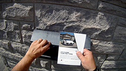
Gold: PFAFF Instant DM Case
Pfaff Auto Toronto, the largest Porsche dealership in Canada, wanted to present their cars as an exciting option to those with the means to make a dream car a reality.
Working with agency Lowe Roche, the brand approached the affluent target on a personal level, bringing them a level of service and attention that they’d both appreciate and expect.
The idea applied a truly innovative approach to the traditionally stale channel of direct mail. Instead of a generic flyer dropped in random mailboxes, the agency created a direct mail piece that was both personal and totally unique.
With a camera, laptop, printer and a Porsche Carrera 911 S, the dealership targeted the driveways of houses in upscale neighbourhoods. The car was parked in each driveway and photos were taken to create a one-of-a-kind postcard, right on the spot.
The postcard drove traffic to Makethatporschemine.com, where the target could then arrange their personal test drive. In keeping with the dealership’s message, Pfaff would bring a Porsche model of their choice right to their home. Of the targeted homes, 32% responded by visiting the PFAFF website where they could book a test drive.
GOLD: James Ready Cover Photo Swap
James Ready Beer engages and celebrates its drinkers in a way that’s very different than other brands. With miniscule budgets, JR has always had to look beyond paid media to connect with its drinkers. Since its launch, the brand has leveraged owned assets like beer cases and bottle caps to incite interaction with its drinkers. It worked, and JR created a small but loyal fan base.
But in 2010 and 2011 the gap between discount and mainstream was disappearing -‐ the minimum price of beer increased and mainstream brands were going on deal more often – giving drinkers a reason to question the value of shopping this category. The changing landscape eroded the price advantage that JR historically enjoyed, and the brand was at risk of losing drinkers.
The objective for the brand’s agency, Leo Burnett, was to retain loyalty and share of stomach through its strong connection with fans, and acquire new drinkers by tapping into current drinkers’ network of friends. The challenge was to do it with a limited budget and only through owned assets.
While price was a factor in first bringing fans into the brand, the agency found what JR drinkers loved most wasn’t the price. What they loved was that the brand was the only beer that really put them at the centre of everything they did by shining the spotlight directly on them. While the price position had changed, what hadn’t changed was the bond drinkers felt with JR’s participatory philosophy.
The solution was to give them more of what they loved by giving fans ownership of one of JR’s most prized assets – the Facebook Cover Image – the largest image space on Facebook above the fold – a space that no other beer brand had ever turned over to their fans before.
The idea was the James Ready Cover Photo Swap – a simple bartering system that allowed drinkers to use JR’s Cover Photo Space, if they let us use theirs. It started with a message on the JR cover photo, “We’ll give you this space, if you give us yours”.
Drinkers used the space to talk to JR fans and promote businesses, spread the word about their bands or concerts, post resumes, sell things, show off their art, impress the ladies, endorse their motorcycle club and more.
On the flip side, fans were able to help spread the JR word by giving up their Facebook cover photo space to JR so it could introduce itself to a new audience of friends. Our message not only appeared on fan Facebook pages for one full day but showed up in their newsfeed letting every friend in their network know that a new cover photo had been posted. Making sure everyone saw the partnership between their buddy and his favourite brew, James Ready.
The James Ready swap continues daily, but in the first three weeks of the program the brand was able to reach almost 6 million people. It saw a 352% jump in page shares and a
402% jump in content likes. And, most importantly, the brand was able to grow its Facebook fans by 37%.
Credits: Chief Creative Officer: Judy John Creative Director: Judy John, Lisa Greenberg Group Creative Director: Anthony Chelvanathan, Steve Persico Copywriter: Steve Persico Art Director: Anthony Chelvanathan Account Executive: Rebecca Simon Account Director: Natasha Dagenais Group Account Director: David Buckspan
Best Tech Breakthrough
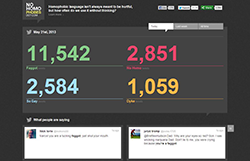
Silver: Nohomophobes.ca
Institute for Sexual Minority Studies and Services, University of Alberta
Launch date:
September 26, 2012
Many people – especially youth – use homophobic language without really thinking about how they're using it. Most of these people are not actually homophobic, but believe it's okay for them to use this language as long as they don't mean to be offensive.
University of Alberta’s Institute for Sexual Minority Studies and Services wanted to change this way of thinking, but the message of “think before you speak” had become tired and no longer resonated with an audience that didn’t think their words were offensive. So working with agency Calder Bateman Communications, the institute decided to actually capture what they were saying and show it to them. Then they could judge for themselves without it having to be preachy.
The best way to capture this type of conversation was online, where the institute could tap into how today’s youth converse casually. Using Twitter's API, tweets featuring "so gay,” "no homo,” "faggot" and "dyke" were pulled, tracked and displayed in real time on Nohomophobes.com – creating a social mirror that shows how frequently and casually homophobic language is used. The code was developed with parameters to capture negative tweets, while filtering out tweets of a positive nature (as much as possible).
The website displayed daily stats, weekly stats and all-time stats. Visitors could also view the stream of tweets in real-time, and pause the live feed and click on any of the tweets, which would direct them to the origin of the tweet and Twitter profile. Once there, they could interact with the tweeter if they chose to do so.
Within 24 hours of the launch, the website received over 100,000 unique visits and our #nohomophobes hashtag started trending on Twitter. It was also featured on the front page of Reddit, and was written about by Mashables, the Economist, the Guardian, Huffington Post, UpWorthy, the Gazette and Jezebel, to name a few.
Credits: Client: Institute for Sexual Minority Studies and Services, University of Alberta Advertising Agency: Calder Bateman Digital Partner: Burnkit Executive Creative Director: Jeff Mclean Executive Creative Director: Josh Dunford Creative Director: Chris Allen Art Director: Nicola Pringle Art Director: Brandon Stephenson Copywriter: Pierre Chan Lead Developer: Jason Funk Interaction Design: Jeff Greenberg Digital Strategist: Adam Rozenhart Account Coordinator: Kayla Panizzon Account Executive: Alysia Lambertus Sr Consultant: Frank Calder Project Manager: Josli Rockafella
Gold: SickKids Pain Squad App
Every year at Toronto’s Hospital for Sick Children (SickKids), thousands of children are treated for cancer. Pain is the worst part for these patients. The hospital is continually working on innovative ways to manage and minimize the pain experienced during treatment. To help them do this they need their patients to record exactly how they are feeling on a daily basis. However, after multiple surgeries, chemotherapy and radiation treatment, many of these children are too tired or discouraged to keep detailed reports. Unless this data is collected consistently, it is worthless to the hospital.
As a result SickKids approached Toronto agency Cundari to help find a creative solution to consistently collect pain data. And with that, the Pain Squad mobile app was born. The agency gave each recruit an Apple iPhone loaded with the Pain Squad app. Twice a day, patients were given an alert from “Headquarters,” telling them that it is time to complete their pain reporting mission. Because the reports worked with iPhone’s user-friendly touch screen, kids could easily fill them out. With a simple flick of the finger, they could easily identify exactly where and how much it hurt as well as which medications were working best.
Making it “easy” was simple. But to truly be successful, there needed to be a way to encourage the young target to do this on a daily basis. So the agency called in some special police reinforcements. It brought together the casts of Canada’s top police dramas, Flashpoint and Rookie Blue, and filmed a series of inspiring videos that were incorporated in the App.
Just like a regular police force, the recruits were challenged to work their way up the ranks. Every time the patients completed 3 reports in a row they received a video from one of our actors informing them that they were receiving an award or being promoted to a new rank. Then once the recruit’s last report was filed, they were sent one final message from police headquarters informing them that they were being retired from the field.
Rather than viewing their pain journal as a chore, children looked forward to completing it. Since its launch, the completion rate for reports has been over 90% – an unheard of compliance rate in pediatric medicine. And for the first time ever, the information being given is coming from the patient themselves. As a result, SickKids is receiving pain data that it can actually use to help current and future patients.
Due to this success, the Pain Squad Mobile App is now being used in three other Canadian pediatric hospitals, and will soon be made available in the Apple App Store so that kids with cancer all over the world will have an opportunity to take control of their pain.
Credits: Client: The Hospital for Sick Children Agency: Cundari Chief Creative Officer: Brent Choi Group Creative Director / Copywriter: Cory Eisentraut Group Creative Director / Art Director: Mike Sipley Interactive Designer: Stuart Thom Account Lead: Mike Orr, Carol-Ann Granatstein Producer: Carol-Ann Granatstein Music/Sound: Ed Zych Developers: Patrick Lee, Jin Kim, Ali Asim, Wayne Gomes (CTO) DOP: Rob Dutchin, Kawal Singh Editor: Cherie O’Connor
AToMiC CSR
Silver: WWF National Sweater Day - Granny Call Centre
Date of Launch – January 31st, 2012
Objective/Challenge:
In 2011, WWF launched National Sweater Day – a day when they asked Canadians to lower their heat and wear a tacky sweater to show support for energy conservation. While most people were genuinely interested in the initiative, many simply forgot by the time the day arrived, and participation was lower than expected.
So for its second year, WWF wanted Sweater Day to reach “Earth Hour” status with a simple idea that would promote countrywide participation, and guarantee people wouldn’t forget. And since they couldn’t afford a traditional media plan, the idea had to be easy (that is: cheap) to execute.
Insight:
Where do Canadians get all their warm, cozy (and tacky) sweaters from? The answer was obvious: their Grannies. Grannies have been trying to get grandkids into sweaters for as long as we can remember – just look at the presents that arrive in the mail every birthday or holiday. So what better way to encourage participation in Sweater Day than with a reminder from a Granny?
Execution:
Many campaigns claim they started a conversation with their customers. But how many can actually say they called and spoke to them personally? To remind people about National Sweater Day, WWF worked with Toronto ad agency John St. to launch “The Granny Call Centre” – where people could sign up to get a reminder call from the Granny of their choice. Users could choose from a wide selection of Grandmas, Nanas, and Bubbies at Sweaterday.ca. They then received a live call from an actual Grandmother, reminding them to lower the heat and put on that cuddly warm sweater their Granny gave them.
The campaign launched with a video on WWF's Facebook, Twitter and YouTube pages, explaining the cause and introducing the Grannies. Throughout the campaign, sample Granny calls were released to keep fans engaged. A Granny media tour was also dispatched, with “SpokesGrannies” appearing on radio and morning shows.
Then came the calls. Partnering with a home for Retired Actors, the agency had 50 volunteer Grannies calling all over North America. People expected to hear a pre-recorded message – what they got was a real live Granny. And she wouldn’t hang up until they agreed to lower their heat and put on a sweater.
Results:
WWF’s objectives were all surpassed, with over 1.6 million Canadians donning sweaters and lowering their heat for Sweater Day – a 55% increase from the previous year’s participation, and the equivalent of taking 175,000 cars off the road for the day.
In 15 days, the Sweater Day campaign received over 33 million media impressions (with no paid media), garnered national and international coverage and was featured on every major Canadian news station: CBC, CTV, Global and CityTV. Sweater Day was also trending on Twitter (in Toronto) that week. The site had over 250,000 visits in under two weeks, and many people signed up multiple times (getting Grannies to call their unsuspecting friends), helping spread the word exponentially. Of those who signed up, more than 50% asked for info on WWF’s other environment related causes.
Credits: Client: WWF Canada Agency: john st. Creative Director: Angus Tucker/Stephen Jurisic Copywriter: Kurt Mills Art Director: Kyle Lamb Agency Producer: Mavis Huntley Account Service: Melissa Tobenstein/Amelia MacGregor Brand Experience/Planning: Nicole Polivka/Tammy Chiasson Director: JJ Adler Production Company: Tool of North America/Radke Exec Producer: Dustin Callif/Miriana DiQuinzio Head of Production/Line Producer: Simi Dhillon/Nick Sorbara Director of Photography: Graham Beasley Editorial: (Editor, Editorial Company): Chris Murphy, Relish Audio House: Vapor Music
Best Brand Integration
Bronze: Stanfield’s Gitchhiker
Date of Launch:
November 14, 2012
Objective/Challenge:
Stanfield’s is a small Canadian underwear company that’s been around for 150 years. With very little to no advertising support in the last 20 years, most young men see it as their Dad’s underwear brand (or worse – their Grandad’s). It needed to find a way to become relevant to a younger audience and show that Stanfield’s is the ultimate Canadian underwear – all on a very limited ($200K all in) budget.
Insight:
To prove Stanfield’s underwear is the Canadian underwear brand, agency John St. challenged one man to hitchhike across the country, in the dead of winter, wearing nothing but Stanfield’s underwear. If he made it within 21 days, the brand would donate $20,000 to support men’s below-the-waist cancer research – which fit perfectly with Stanfield’s motto, “We Support Men.” The brand needed a better name than Hitchhiker. So, the agency took a popular slang term for underwear and thus, the “Gitchhiker” was born.
Execution:
Stanfield’s partnered with the Canadian Cancer Society, and found an eager testicular cancer survivor to be its hitchhiker. His job was to raise awareness and support, handing out free ‘thumbs-up’ underwear as he went. Next, the agency developed a Facebook app (GitchHiker.com) where fans could follow every aspect of his journey, including his current location, what the temperature was and what underwear he was wearing. They could also help him out with daily gifts, dares or even sign up to give him a ride – which they did without hesitation. The Gitchhiker was given complete social media control of the brand’s Facebook and Twitter accounts – posting pics, videos and even pleas for help when he couldn’t find a ride.
Results:
Turns out, growing a moustache isn’t the only way to get attention in November. In just 21 days, and with no paid advertising, the campaign generated over 43 million media impressions. The Gitchhiker himself completed 64 separate interviews on various television and radio programs, including several three minute-plus segments on CBC and CTV national news. What’s more, underwear sales increased by 50% during the campaign and Facebook fans increased by 500%.
The Gitchhiker also collected thousands of dollars in donations along the way, which – combined with Stanfield’s donation – garnered a total of $32,398 for the Canadian Cancer Society.
Credits: Agency: John St. Client: Stanfield’s Creative Directors: Angus Tucker, Stephen Jurisic, Nellie Kim, Chris Hirsch Writer: Kurt Mills Art Director: Kyle Lamb Producer: Ryan Bourret Account Service: Andrew Godfrey, Melissa Tobenstein, Joelle Woodruff Online Design/Production: Secret Location Production Company: Secret Location Exec Producer: James Milward Producer: Ashlee Lougheed Creative Director: Pietro Gagliano Art Director: Stefan Grambart Designer: Kai Salminen Technical Director: Ryan Andal Developers: Paul Stodolak, Adam Drake Coordinator: Adam Park Chase Producer: Nick Matthews Shooter & Editor: Stephen Dagg Assistant Editor: Michael Kazanowski Editing/Online House: Relish Executive Producer Relish: Sally Leggett Editor: Chris Murphy Assistant Editor: Michael Barker The Gitchhiker: Mark McIntyre
Silver: Raising the Roof – The Street House
Raising the Roof is Canada’s only national charity devoted to long-‐term solutions for homelessness. And in 2010, it approached Leo Burnett with an objective to generate awareness for homelessness in Canada.
But there were two major challenges. With more than 85,000 registered charities in Canada, how on earth do you break through to people in the age of donor fatigue, and give them a reason to support this cause versus another? And given that homeless people are stigmatized groups that others would rather ignore than help, how do you create empathy and incite change?
The objective was to get Canadians to stop and think about the homeless and consider the truth behind the issue – and do so through donated time, production, services and media.
Homeless equals hopeless. People walk by and sometimes step over or around homeless people without thinking twice. They are almost immune to the struggles of the homeless and assume they are all troublemakers, lazy or drug addicts. So what’s the point in helping them?
The Street House was created to be an innovative act that people could not ignore –
an act that would function as the message in and of itself, re-‐humanizing the homeless by demonstrating their struggles in a meaningful, digestible and thought-‐provoking way.
During Doors Open Toronto (a weekend where Torontonians are invited to tour normally off-limits spaces), we invited people to tour The Street House. A house they would traditionally go out of their way to avoid. A house made of cardboard and built in a city alleyway. The Street House provided an experiential walk-‐through that showcased the day-‐ to-‐day struggles of the homeless. People could feel and interact with real hard facts and stories and were put in the shoes of the homeless they walk past everyday and completely ignore. This was the first time a charity message was presented in such a dynamic, impactful way.
Over the course of two days over 2,200 people toured The Street House making it content for conversation in the real and digital worlds. Millions experienced it through media (newspapers, TV, blogs, sites) or word of mouth. The goal of the act was to get Canadians to stop, think and act and that goal was achieved – people donated money on site, shared their experience and signed the wall in support of the issue. All this from a budget of $0.
Credits: Chief Creative Officer: Judy John Creative Director: Judy John, Lisa Greenberg Copywriter: Steve Persico Art Director: Anthony Chelvanathan Agency Producer: Kimberley Burchiel Account Director: Natasha Dagenais Account Supervisor: Jeremy Farncomb Production Company: Family Style
AToMiC ROI
Bronze: Canada’s Best Beauty Talent:
Launch date:
January — April 2012
Insight:
Media habits are changing, consumers expect to access information and entertainment where, when and however they want. Digital video and social media are on a drastic rise. Branded content is fast becoming the most exciting and dynamic method of engaging audiences today.
With this key insight, L’Oréal Canada, Rogers Media and ZenithOptimedia teamed up to create a first-to-market, multi-platform, webisodic reality program.
The Program
“Canada’s Best Beauty Talent” was a multi-brand execution for both L’Oréal and Rogers Media brands. The challenge was to launch a multi-brand program that allowed for brand-specific activations within the overall program. This was achieved by the construct of the content program: the program was launched as the “master” brand and themed activations were created to showcase the multiple product and media brands.
Utilizing L’Oréal’s unparalleled beauty expertise, the program showcased the country's up-and-coming talents as they vied for the title in a series of innovative challenges, in a high-quality 12-part digital reality series.
Bringing together leading Rogers’s media brands Citytv, FLARE, HELLO! Canada, LOULOU, Chatelaine, as well as L’Oréal Canada's top beauty brands L’Oréal Paris, Yves Saint Laurent, Lancôme, L’Oréal Professionnel, Kérastase — each episode saw promising hair and makeup artists teaming up to create a specific look for each week's challenge. Twists, turns and drama unfolded as the contestants competed to impress the panel of celebrity judges in hopes of being named Canada's Best Beauty Talent.
Hosted by Canadian and internationally acclaimed fashion model, Coco Rocha, the show rolled out as a digital series viewed online via web, mobile device and tablet via Citytv’s Video apps, on television via Rogers AnyplaceTV (on-demand) and Rogers AnyplaceTV Online. Social media was used extensively to drive viewership and audience engagement (Facebook and Twitter) and custom magazine creative was used to showcase winners.
Canada’s Best Beauty Talent was closely tied to select Rogers Media consumer brand magazine titles via content integration and usage of beauty and hair experts. The editors of Flare, Hello! Canada, Loulou and Chatelaine magazine were featured as expert judges. In addition, the program received editorial and social media support via editorial coverage, editor’s letters and tweets throughout the program.
In addition to the trip to Paris for the winner (for a L’Oreal brand experience), the hair/make-up winners were featured in custom spreads in the magazines.
Program results were measured and a custom web survey was conducted to measure content engagement, acceptance of the webisodic genre, content quality, brand recognition and intent to purchase.
From the show’s announcement in January to the series launch in April 2012, the series brought brand integration to the next level, cleverly balancing entertainment with brand messaging. Benchmarks were established for integrated branded content programs in the future and proved that the webisodic branded content genre resonated with the target.
Results:
- 210 press hits from media in Canada and globally (Russia, France, USA, Singapore etc…)
- Press coverage earned more than 31 millionmedia impressions
- Total media impressions: 57,524,846
- Average time spent with each episode: 9 min 44 sec
- 162,272 unique video views
- 87% brand recall
- 79% of viewers indicated intent to purchase a L’Oréal product
- 98% of viewers wanted to see more
- ROI 369 (every $100 spent returned $369 value)
- Impressions 45,023,420
- Brand lift: 50% improvement
- Purchase intent 70%
- L’Oréal International deemed this program a global best marketing digital practice
Credits: Client: Marie-Josée Lamothe, CMO & COO L’Oréal Canada Media Partner: Jacqueline Loch, VP Content Solutions, Rogers Media Inc. and
Laura Denton, Director Women/Fashion/Beauty, Client Solutions, Rogers Media
Agency: Julie Myers, President, ZenithOptimedia Canada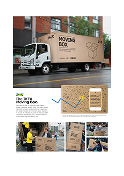
Gold: Ikea Moving Day
In 2011, IKEA moved into the hearts of Montrealers with its first ever “Moving Day” campaign. It was a tremendous success, creating tons of buzz and business. The brand knew though that great reward would mean great expectations the next year.
The challenge for 2012 was to evolve the campaign to not only increase sales versus the previous year, but further demonstrate the brand’s commitment to making a move organized by Ikea, a move made better – a big challenge considering 2011 saw a 24% increase in sales on Moving Day weekend. To put this in context, that would be the equivalent to Ikea building, stocking, and opening an additional 300,000 square foot store in Montreal.
But why is moving in Montreal at this time such a big deal? Because every July 1st long weekend in Canada, a cultural phenomenon happens. The people of Quebec move, not one by one, but all at once. They call it Moving Day and it leads to all kinds of chaos. Imagine 225,000 Montreal residents, in a city of 1.8 million, moving all at the same time. In 2011, the brand and its agency Leo Burnett saw this as an opportunity to demonstrate Ikea’s purpose – to provide a better everyday life for the many people – helping move Ikea into the hearts and minds of all Montreallers, and Montreallers into an IKEA store.
In 2011, the agency saw a huge opportunity to tap into the cultural fuel of urban communalism – people’s desire to return to a time when neighbour helped neighbour, neighbour knew neighbour, and a sense of ‘we’ versus ‘me’ was felt around the block. In doing so, the brand could help move anxious urbanites in Montreal from a feeling of disorganized desperation to a state of composed and organized optimism.
The approach in 2012 was to supplement innovative ambient wild postings featuring takeaway boxes with a social media component that would allow even more people to take advantage of free Ikea moving boxes.
As boxes and trucks are a big part of any Moving Day, the agency turned a moving truck into a giant moving box filled with thousands of free boxes for Montreallers looking for help on Moving Day. And it got the word out about the truck through Twitter where Montreallers could follow its route via GPS to see when it would be coming to their neighbourhood.
The follow-up to the initial Moving Day campaign was a big success. Twitter hashtags of #IKEAMovingBox and #IKEABoitePratik generated a total reach of 981,420 – the biggest Twitter trend that weekend in Montreal. From a business standpoint, visitors increased 5.2% and sales increased 9% versus the previous year. The second Moving Day continued to create fantastic momentum for Ikea Montreal, and further cement its position as the city’s favourite home furnishings helper.
Credits: Chief Creative Officer: Judy John Creative Director: Lisa Greenberg Group Creative Directors: David Federico, Morgan Kurchak Copywriter: Andrew Caie Digital Copywriter: Matthew Doran Art Director: Noel Fenn
Digital Art Director: Sean Perkins Designer: Noel Fenn Illustrator: Noel Fenn Developer: David Freedman Director, Creative Technology: Felix Wardene Agency Producer: David Eades Account Supervisor: Danielle Iozzo Account Director: Natasha Dagenais Group Account Director: David Kennedy Planner: Dustin Rideout, Brent Nelsen Project Manager: Lyndsay Cattermole Digital Producer: Thomas Degez Associate Creative Director – Digital: Ian Kay Social Media Planner: Heather Morrison
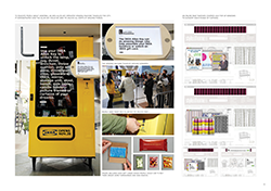
Silver: Learn IKEA
Launch Date:
October 2012
IKEA has aisles of inspiration with its showrooms and self-service with a warehouse where people can find products and then self-‐assemble at home. It’s a shopping experience unlike any other. Now, imagine you’ve never been to one. It’s thrilling and daunting all at the same time. How do I shop the store? What do you mean I have to find the couch in a warehouse? Put it together myself?
Those were the challenges facing Ikea when it opened its first store in the city. With only 17% of Winnipeggers aware of Ikea and with the nearest store being over 2,000 km away, the vast majority had no familiarity with the Ikea concept.
It all added up to two big advertising challenges. Firstly, the brand (with the helped of agency Leo Burnett) needed to generate the awareness and excitement needed to drive big crowds to opening week. And secondly, it needed to create understanding, because big crowds could also equal chaos (and negative first impressions if those big crowds had no idea how to shop the store).
To address the challenges, the brand needed an idea that would educate Winnipegers on the Ikea concept. And “Learn Ikea” was born: a campaign that would excite and educate people about the brand, its products, its shopping experience and its unique personality.
For the six weeks leading up to opening day, Winnipeg was turned into a virtual classroom, with every
medium used to excite, teach and even quiz the Winnipeggers about IKEA.
The campaign began by dropping Learn Ikea handbooks at homes across Winnipeg. The fun and stylish crib notes covered all the chapters in the Ikea story from its history, style, quality, organization and value principles, to enjoying meals in the restaurant.
Newspaper, OOH, ambient and digital took learning further with interactive lessons on Ikea. And local TV and radio spots were turned into opportunities for Winnipeggers to take quizzes to demonstrate their growing knowledge of Ikea and to win gift cards for opening week. And they were introduced to the iconic Ikea Allen Key with a portable vending machine that traveled the city giving people a chance to unlock Ikea food products and gift cards with the simple turn of an Allen Key.
Social media played a big role in creating a shared learning curriculum. Twitter and Facebook were used to give people sneak peeks of the store, to ask and answer questions and to generate buzz for the vending machine as it moved around the city.
When opening day and week arrived, Winnipeggers flocked to Ikea to show off their knowledge. Ambitious sales and conversion goals based on store openings from much larger established markets were exceeded. And with average ticket prices exceeding goals by a whopping 22%, Learn Ikea solved the fears of potential chaos resulting from thousands of first-‐time shoppers by turning them into happy first-‐time buyers.
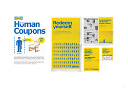
Bronze: IKEA Human Coupon
How do you create excitement and drive visitation for a new Ikea store opening in a city undergoing a retail expansion boom (not to mention for a brand that’s already been there 34 years)? A new store – even for a brand as loved as Ikea – now equaled old news for the people of Richmond. We had to find a way to make a new, bigger and better Ikea store opening an event that couldn’t be ignored.
In order to convince people that opening day was a must attend event, Ikea’s agency Leo Burnett fundamentally reinvented the last bastion of shopping motivation – discounts (aka coupons). For decades, people have been seeking out the ultimate deal to get savings at their favourite stores. The agency saw this as an opportunity to reinvent the coupon itself – because if one thing is true about people, there’s nothing like the unknown to spark our curiosity.
The agency created the very first “Human Coupon,” turning regular people into living, breathing coupons to be redeemed on opening day.
The creative idea was brought to life through a combination of highly innovative media executions. In newspaper, the “Birth Announcement” page was turned into an ad congratulating people on the birth of their “Coupons.” In OOH, live people were part of ambient street-level executions promoting “Human Coupons” and Human Coupons were hidden around the city for people to find via clues released on Twitter. If someone found one of the Human Coupons, they were rewarded with gift cards to redeem on opening day.
The brand’s hard-working human billboards provided the warm and cheeky Ikea human connection that a static billboard or online ad just can’t. On top of mass media impressions of over 30 million (98% reach, 42 frequency), the brand saw 50,000+ interactions with its live Human Coupons alone and the detailed education paid off.
As a result of the campaign and the talented human coupons, the results achieved were well above objectives: Visitors opening day exceeded the goal by 45% and sales opening day exceeded the goal by +42%.
More importantly, the behaviour continued long after the campaign effort was over. In week one, sales increased 41% VYA and visitors increased 92% VYA. In week two, sales increased 19% VYA same period and visits increased 49% VYA.
When compared to a same store opening sales in a similar market (Ottawa) the brand saw higher levels of success: driving 46% of sales versus Ottawa results and visitors was 13% more versus Ottawa results.
Credits: Chief Creative Officer: Judy John Creative Director: Judy John, Lisa Greenberg Group Creative Directors: David Federico, Morgan Kurchak Copywriter: Andrew Caie, Morgan Kurchak, Steve Persico Digital Copywriter: Kevin Hoessler Art Director: Noel Fenn, Anthony Chelvanathan Digital Art Director: Mark Nilsen, Trevor Bell Designer: Noel Fenn Illustrator: Infomen Developer: David Freedman Director, Creative Technology: Felix Wardene Agency Producer: David Eades Account Executive: Rebecca Simon Account Supervisor: Danielle Iozzo Account Director: Jennifer Kelly Group Account Director: David Kennedy Planner: Dustin Rideout, Brent Nelsen Project Manager: Lyndsay Cattermole Digital Producer: Thomas Degez Associate Creative Director – Digital: Ian Kay Social Media Planner: Heather Morrison
Best Broadcast Engagement:
Silver: Over the Rainbow
Launch date:
September 16, 2012
Over the Rainbow was a TV talent show to cast the role of Dorothy in Andrew Lloyd Webber's stage production of The Wizard of Oz.
Objectives
The fundamental goal of Over the Rainbow’s interactive strategy was to engage a passionate community of fans around the show. To do this, broadcaster CBC gave the fans a real stake in the show. Not only did the community ultimately pick their winner, but they also judged the contestants during the show and followed the contestant’s journey during the week.
The entire Over the Rainbow experience was designed to be simple and fun, to get audiences to go above and beyond typical engagement. The TV show was ultimately a game, in which the audience got to pick the winning Dorothy via the show’s website using their desktop and mobile device.
From the inception of the show, a clear role was defined for the audience, and as such it became much more than a TV show, it was an experience that involved the audience. It extended from living rooms, to online, and ultimately out into the real world.
The approach was an outstanding success, with Over the Rainbow being one of the most successful examples of broadcast engagement the CBC has ever done – 5.2 million page views, 1.2 million challenges complete, 60,000 fans participating (source: Omniture).
Execution
The success was due to the employment of game-theory techniques, second-screen technology and an extensive editorial strategy.
Using a multi-platform second-screen app (available via Android, iOS and Web-browser) the audience could rate a performance in real time, and have that rating displayed back on television, live – in every time zone.
The app was the introduction to a world of interactivity around the show, in which the CBC told the story of Over the Rainbow with the audience, not to them. It also encouraged the community to participate in challenges such as polls, quizzes, displays of fandom, and real world activities – all of which earned the fans more votes that they could use towards their favourite Dorothy.
The more activities a user completed successfully, the more votes they earned. Again, the goal was to convert the audience from passive viewers into an active community. And it worked.
Results
Over the Rainbow was one of the most successful online properties in the CBC's history. It was a 24/7 digital experience for its audience, and made the TV show more fun, more interactive and more engaging for the fans. About 60,000 registered during the season, more than 200,000 visited the web site, and they contributing to 5.2 million page views, more than quadruple the traffic for other shows.
Credits: Senior Interactive Producer, CBC: Paul Mcgrath Interactive Producer, CBC: Rose Paton Director, Interactive, CBC: Tessa Sproule Associate Producer, CBC: Jesse Todd Associate Producer, CBC: Kyle Richmond Founder, Konrad Group: Bill Konrad Founder, Social Game Universe: Nathon Gunn Founder, TVplus: Randy Shiozaki
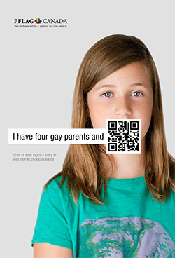
Gold: PFLAG – Stories
PFLAG support groups are traditional places for people to share their stories. But with a small physical presence and no marketing budget, awareness of this form of support was low. The organization, and its agency Draftfcb, used technology to turn a support group into a support network.
They amplified a regular support group by taking it to the streets, TV, radio, and mobile by sharing the beginnings of stories alongside an instant response code to hear the endings.
QR codes are not designed for TV, but by leveraging the popular PVR, they could bring this tool to a wide network. And, in a worldwide first, they brought the functionality of a QR code and put it on radio where a story (instead of music) was Shazam-enabled.
Over $500,000 in media was donated, leading to 78 million impressions, over 30,000 video views, and an Italian ally of PFLAG adapting the campaign, ensuring increased awareness for PFLAG and an innovative way to look at a traditional support group.
Best Experiential Engagement
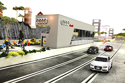
Silver: Audi quattro Experience
Launch Date:
September 10, 2012
Objectives & Challenges:
In automotive sales, driving is believing. But over the decades, little innovation had been applied to the traditional test-drive. To promote the new Audi A4, agency Zulu Alpha Kilo set out to change this and reinvent the test-drive to let consumers put the road-hugging capabilities of the 2013 Audi A4 to the test in a new and unexpected way, while highlighting Audi innovation and precision craftsmanship.
To do so, the brand had to connect in a meaningful way with a demographic who are thoughtful, logical and rigorous when they shop – more so in this category. Their strong sense of self and value of unique, thoughtful, personalized solutions are a great match for the brand, but force communications to work that much harder to impress.
Insight, Concept & Execution:
The solution was the Audi quattro Experience, a one-of-a-kind interactive installation, putting drivers directly behind the wheel of custom fabricated 1:32 scale all-wheel drive slot cars. Using the world’s first iPad enabled slot car controller, visitors to the installation were able to take their A4 for a wild test-drive around hairpin turns, down long highway straight-aways and through icy mountain passes – terrain that would get the better of lesser vehicles.
Several partnerships were forged to bring the project to fruition and extend its reach beyond the limits of a physical location including a team of world-class track builders, custom prop and model makers, technology integrators and filmmakers. And as the project evolved, what was originally intended as a behind the scenes “making of” video quickly turned into a human story about one of the craftsmen themselves.
The film, entitled “Painting Coconuts,” captures the entire build through the eyes of track maker David Beattie of Slot Mods USA. Set behind the scenes leading up to launch of the installation, the film offers a unique look into Beattie’s personal story, his passion for the art of custom track design and the sport of slot car racing. It also delves into his process and the challenges his team faced to execute a project with so many innovative features. At the same time, the documentary perfectly captures Audi’s ideals of innovation, craftsmanship and passion.
Results & Impact:
Impact was immediate and widespread with press coverage of the event and documentary appearing on Fast Company, Mashable, Techcrunch, Engadget, Devour, PSFK, Road & Track and AutoBlog, among others.
Over the two-week activation, the brand put 3,932 test drive participants “behind the wheel” – a 4,525% increase over the average total a top ranking dealership would normally handle over the same period. It also generated over 120,000 YouTube Channel views of race videos shared over social media and nearly 800,000 overall experience impressions in the heart of the downtown legal and financial district where the primary demographic live and work.
And since its launch in early January 2013, the 15-minute documentary has been seen by over 173,000
unique viewers (and counting) with no additional media support or spend.
Credits: Agency: Zulu Alpha Kilo Creative Director: Zak Mroueh, Shane Ogilvie Writer: Jon Webber Art Director: Simon Au Agency Producer: David Isaac Account Team: Adam Lang, Barrett Holman, Christina Polyzos Client: Audi Canada Clients: Jennifer Dobbs Production House: Industry Films Digital Production House: Thinkingbox Director: Tamir Moscovici Media Agency: Mediacom Track Fabrication: Slot Mods Event Company: Vision Co. Car Model Fabrication: Uplis Ltd
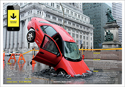
Silver: Taxi Montreal Pothole Season
Description
The Taxi campaign uses a new tool to fix an old problem, one that has plagued the city of Montréal.
Every Spring, sophisticated Montréal has to deal with a down-to-earth problem. The Spring thaw generates crater-like potholes in the city’s streets and highways. It’s actually referred to by locals as “pothole season.”
Since the potholes aren’t going to go away, the agency decided to do something about it. Twenty years after Taxi was founded in Montréal, it developed a tool, the “Pothole Season” iPhone app, to help people deal with this perennial feature of life in the city.
Execution
The campaign was totally integrated, led by the mobile app. The app was launched with a high-visibility stunt that literally stopped traffic and was sustained with a multifaceted, integrated campaign. On one of downtown Montréal’s busiest streets, an upended car was embedded in a massive pothole and surrounded by official-looking police tape and barricades.
The campaign continued with print ads demonstrating lipstick smears and coffee mishaps experienced by not-so-lucky drivers, as well as on a website that mapped all the reported potholes. Social media was embedded into the app through Facebook.
Results
Montréal’s media swarmed the stunt, generating over 120 minutes of TV and radio airtime, and reaching a potential audience of 50 million—not to mention the potential online audience of one million via Taxi’s Twitter and Facebook pages.
The car embedded in a giant pothole was instantly circulated in social media and on more than 150 blogs and sites. Montréal’s main newspaper, with over 1.2 million readers, made it the subject of an editorial cartoon. Fast Company featured the app, which topped the ranks of downloaded apps on the Canadian App Store in the utilities category. In less than seven days, it was downloaded 10,000 times, and over 7,000 potholes were reported to municipal authorities.
Credits:
Mobile App and Website Conception: Taxi Montreal Production: QuatreCentQuatre et The Barn&Co.
Advertising campaign: Agency: Taxi Montreal Executive creative director: Dominique Trudeau Creative director: Jean-François Houle Art direction: Frédéric Roux Copywriting: Martin Charron / Jean-François DaSylva-LaRue Project manager: Nada Debay Agency producer: Maxime Boivin, Jacques Latreille Photography: Alain Desjean Retouching: Visual Box Mac Artist: Patrick Saunders Print producer: Hélène Joannette Coordinator: Anne Gouin Media: Média Experts Video and sound editing: Minh Tran and Studio La Majeure Social media: Rock&Social Public relations: Morin Relations Publiques Stunt: ALT
Silver: Raising the Roof “Street House”
Raising the Roof is Canada’s only national charity devoted to long-‐term solutions for homelessness. And in 2010, it approached Leo Burnett with an objective to generate awareness for homelessness in Canada.
But there were two major challenges. With more than 85,000 registered charities in Canada, how on earth do you break through to people in the age of donor fatigue, and give them a reason to support this cause versus another? And given that homeless people are stigmatized groups that others would rather ignore than help, how do you create empathy and incite change?
The objective was to get Canadians to stop and think about the homeless and consider the truth behind the issue – and do so through donated time, production, services and media.
Homeless equals hopeless. People walk by and sometimes step over or around homeless people without thinking twice. They are almost immune to the struggles of the homeless and assume they are all troublemakers, lazy or drug addicts. So what’s the point in helping them?
The Street House was created to be an innovative act that people could not ignore –
an act that would function as the message in and of itself, re-‐humanizing the homeless by demonstrating their struggles in a meaningful, digestible and thought-‐provoking way.
During Doors Open Toronto (a weekend where Torontonians are invited to tour normally off-limits spaces), we invited people to tour The Street House. A house they would traditionally go out of their way to avoid. A house made of cardboard and built in a city alleyway. The Street House provided an experiential walk-‐through that showcased the day-‐ to-‐day struggles of the homeless. People could feel and interact with real hard facts and stories and were put in the shoes of the homeless they walk past everyday and completely ignore. This was the first time a charity message was presented in such a dynamic, impactful way.
Over the course of two days over 2,200 people toured The Street House making it content for conversation in the real and digital worlds. Millions experienced it through media (newspapers, TV, blogs, sites) or word of mouth. The goal of the act was to get Canadians to stop, think and act and that goal was achieved – people donated money on site, shared their experience and signed the wall in support of the issue. All this from a budget of $0.
Credits: Chief Creative Officer: Judy John Creative Director: Judy John, Lisa Greenberg Copywriter: Steve Persico Art Director: Anthony Chelvanathan Agency Producer: Kimberley Burchiel Account Director: Natasha Dagenais Account Supervisor: Jeremy Farncomb Production Company: Family Style
Gold: Ikea Moving Day
In 2011, IKEA moved into the hearts of Montrealers with its first ever “Moving Day” campaign. It was a tremendous success, creating tons of buzz and business. The brand knew though that great reward would mean great expectations the next year.
The challenge for 2012 was to evolve the campaign to not only increase sales versus the previous year, but further demonstrate the brand’s commitment to making a move organized by Ikea, a move made better – a big challenge considering 2011 saw a 24% increase in sales on Moving Day weekend. To put this in context, that would be the equivalent to Ikea building, stocking, and opening an additional 300,000 square foot store in Montreal.
But why is moving in Montreal at this time such a big deal? Because every July 1st long weekend in Canada, a cultural phenomenon happens. The people of Quebec move, not one by one, but all at once. They call it Moving Day and it leads to all kinds of chaos. Imagine 225,000 Montreal residents, in a city of 1.8 million, moving all at the same time. In 2011, the brand and its agency Leo Burnett saw this as an opportunity to demonstrate Ikea’s purpose – to provide a better everyday life for the many people – helping move Ikea into the hearts and minds of all Montreallers, and Montreallers into an IKEA store.
In 2011, the agency saw a huge opportunity to tap into the cultural fuel of urban communalism – people’s desire to return to a time when neighbour helped neighbour, neighbour knew neighbour, and a sense of ‘we’ versus ‘me’ was felt around the block. In doing so, the brand could help move anxious urbanites in Montreal from a feeling of disorganized desperation to a state of composed and organized optimism.
The approach in 2012 was to supplement innovative ambient wild postings featuring takeaway boxes with a social media component that would allow even more people to take advantage of free Ikea moving boxes.
As boxes and trucks are a big part of any Moving Day, the agency turned a moving truck into a giant moving box filled with thousands of free boxes for Montreallers looking for help on Moving Day. And it got the word out about the truck through Twitter where Montreallers could follow its route via GPS to see when it would be coming to their neighbourhood.
The follow-up to the initial Moving Day campaign was a big success. Twitter hashtags of #IKEAMovingBox and #IKEABoitePratik generated a total reach of 981,420 – the biggest Twitter trend that weekend in Montreal. From a business standpoint, visitors increased 5.2% and sales increased 9% versus the previous year. The second Moving Day continued to create fantastic momentum for Ikea Montreal, and further cement its position as the city’s favourite home furnishings helper.
Credits: Chief Creative Officer: Judy John Creative Director: Lisa Greenberg Group Creative Directors: David Federico, Morgan Kurchak Copywriter: Andrew Caie Digital Copywriter: Matthew Doran Art Director: Noel Fenn
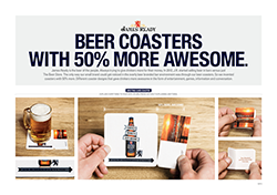
Bronze: James Ready 50% Awesomer Coasters
James Ready Beer is the beer of the people and has always tried to give drinkers more for their money. It engages and celebrates its drinkers in a way that’s very different than what other brands do, and that’s helped it stand out despite miniscule budgets.
Every campaign, act or touchpoint has proved that James Ready behaves differently and has always highlighted a new twist on what has traditionally been done -‐ offering a unique experience that is meant to surprise and delight fans. Breaking from the pack and doing things differently was especially important when James Ready decided to launch in bars across ON.
Apart from stopping beer condensation from creating a puddle or keeping your fingers busy by ripping them to shreds, coasters don’t really add any value to the drinking experience. And let’s be honest, the brewing story and heritage that most brands feature on their coasters only talks to one person, themselves. When guys get time away from the family and all those responsibilities and are out with their buddies, it’s all about the experience, being entertained by friends and the laughs that go along with that.
The objective was to give JR a seat at the table and play an active role in entertaining and creating those laughs using coasters. The challenge was to get noticed in the overly beer branded bar environment. The solution was to take the expected and make it unexpected.
The first ever coaster with more (50% more to be exact) was born, with the help of agency Leo Burnett. When James Ready hit the bar scene in 2012 it was accompanied by a new kind of coaster. Not just your usual brand story, logo or brewing history, but a coaster that’s sole purpose was to make the bar experience more awesome for drinkers – 50% more awesome.
When ordering a JR, one of thirteen coasters gave drinkers more in the form of entertainment, games, information, conversation and size. Some coasters were useful by giving drinkers conversation starters and enders. For example, beer rain checks so buddies wouldn’t forget to pay you back a beer. Some were playful, helping guys pass the time with bar games like penny hockey or Guy.Q. Test. Some even allowed guys to save their butt with cards for their girlfriend and/or wife that said “Where was I last night? Your rhetorical questions are so cute.” Or cards for co-‐workers that said “Sorry you found out we went to the bar without you… Next time we’ll try to be more secretive.” The cards were perforated and could be collected, saved and traded.
After a few short months it was clear that JR had once again been able to leverage creative innovation to stand out and get noticed. Not only were bar managers calling requesting more of our coasters, but the brand experienced significant growth with an increase of 60% in beer consumption between the first and third month.
Credits: Chief Creative Officer: Judy John Creative Director: Judy John, Lisa Greenberg Copywriter: Steve Persico Art Director: Anthony Chelvanathan Illustrator: Chris Duchaine, Cheryl Geonanga Agency Producer: Kim Burchiel Account Executive: Rebecca Simon Group Account Director: Natasha Dagenais
Best Print Engagement
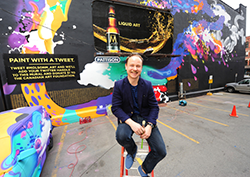
Gold: Molson M - Paint with a Tweet
Launch date:
April 2012 – June 2012
The Challenge
In early 2012, Molson M launched a new campaign utilizing both TV and OOH to create awareness for the brand’s new positioning “Liquid Art” - celebrating not only the inherent artistry of the beer but artistry wherever it’s found. While the work generated a lot of buzz, the challenge was to continue the conversation and create a consumer experience worth talking about.
The Insight
Through segmentation, the brand and agency BBDO identified the core target Molson M appealed to – people who seek something a little smarter, thought-inspiring, and one-of-a-kind.
From inception, Molson M was rooted in creativity. It was intentionally crafted with solid design cues, sophistication and an aura of higher quality. On the surface, Molson M seemed to match perfectly with our target psychographics.
As the brand considered this segment, it was inspired by Professor Richard Florida’s “Creative Class” – a minority population that fuels creativity and sets the pulse of a city’s scene – writers, artists, designers, musicians. This was the group it wanted to talk to.
We are all innately creative and when a person’s natural creativity is fostered, great things can happen. This led to the brand platform: Molson M allows natural creativity to flourish. Our inspiration was to provide the target a forum for expression and Molson M would help their creativity flourish.
The Plan
The brand created the world’s first twitter-powered wall mural. By mashing up two channels, a static billboard and social media, it let consumers become part of the art itself and provided a uniquely creative experience.
Molson encouraged consumers to tweet #MolsonM_art, and with each tweet, a 100-foot mural in Toronto unfolded, becoming a living, breathing display of Molson M’s connection to creativity.
The brand played off the target’s desire to express their innate creativity and rewarded participation by adding their twitter handles to the mural, and with each tweet, donated $1 to the Canadian Art Foundation, further solidifying Molson M’s belief that fostering creativity yields great results.
BBDO had a modest budget to create awareness and drive the conversation. For under $20K it created display banners and utilized sponsored tweets. The agency relied on media relations and Molson owned media to drive earned media. It contacted key influencers and bloggers in the beer and arts communities to get the word out. It also tweeted messages daily, thanked participants, kept a running tally of the results and drove participation right down to the final day.
The Results
In 140 characters or less, beer, art, and social media came together to create a piece of art that gave consumers something to talk about and the results speak for themselves:
- In 30 days, the brand yielded 10,000 tweets, more than any other beer brand during the same time period and more tweets than three of the four remaining teams in the NHL playoffs.
- The mural became an art event listing in NOW magazine’s online edition.
- The Molson Twitter account grew 51 times over
- Social mentions for Molson M increased by 18 times.
- The campaign generated more than 11.6 million impressions.
- Molson matched the $10K produced by tweets for a total donation of $20,000 to the Canadian Art Foundation.
And, once the paint was dry, an app was created where participants could find their handles on the wall and share it out to their friends and followers.
Credits: Client: Molson Coors Canada Product: Molson M Agency: BBDO Toronto SVP, Executive Creative Director: Carlos Moreno SVP, Executive Creative Director: Peter Ignazi Writer: Nancy Crimi-Lamanna Art Director: Deborah Prenger Digital Project Manager: Matthew Dewall Print Project Manager: Kathie Hintsa Photographer: Peter Shafrick Illustrator: Kustaa Saksi Digital Strategist: Nicole Polivka Digital Strategist: David Jones Community Moderator: Ryan Dalziel Managing Director: Lezlie Grossman VP, Group Account Director: Lorri MacDonald VP, Group Account Director: Brent Rivard Account Supervisor: Gavin Wiggins Account Executive: Jade Brent
Molson: VP, Marketing: Jennifer Davidson Director of Marketing: David Bigioni Senior Brand Manager: Martine Bouthillier Brand Manager: Sonia Palazzo
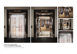
Silver: PAX Elevator Closet
Every January, Ikea hosts a bedroom event and offers an incentive to purchase a PAX wardrobe. Historically this has been a strong month for PAX wardrobe sales, but how do you ensure continued success when the product, benefit and offer remain unchanged?
The objective was to increase sales of PAX wardrobe systems during the January 2012 PAX event. The challenge was to, despite having nothing new to talk about, demonstrate PAX’s customizable solutions in a fun new way.
Although our target sees Ikea as the leader in organization, the importance of being organized doesn’t extend to her bedroom. She puts her family first, and prioritizes everyone else’s needs before her own. When it comes to organization, she understands the importance of it in the home, but in the bedroom, she is oblivious to the transformative effect it could have on making her life easier. Print and television advertising do a good job of communicating the benefits of PAX, but nothing compares to seeing a full PAX solution in 3D at an Ikea store.
The idea was to bring the store experience directly to the target through 3D print opportunities. To do this, Ikea and its agency Leo Burnett wrapped the exteriors and interiors of elevators in office buildings across Canada and turned them into stunning 3D representations of a dream PAX wardrobe that any woman would yearn for.
The elevator doors were wrapped with “French Door” imagery to create the illusion that passengers were walking into a closet. Once inside, all four walls of the elevator were wrapped to appear as if they had walked into the closet – the most well-organized closet ever.
The imagery included the back of the “French Doors” and a fully dressed interior of an organized woman’s wardrobe complete with clothes and accessories all neatly organized with the help of the interior customizable fittings – bringing to life the transformable effects that an Ikea PAX wardrobe can have in helping organize a person’s life.
The act allowed Ikea to literally surround the target with the product benefit in an unexpected way, using 3D print to make it feel as real as being in the store itself. More significantly, Ikea saw sales increase by 26% versus the previous year, which proved that, with the right approach, you can make old news, new news.
Credits: Chief Creative Officer: Judy John Creative Director: Judy John, Lisa Greenberg Group Creative Director: David Federico, Morgan Kurchak Copywriter: Morgan Kurchak, Matt Williamson Art Director: David Federico, Monique Kelley Agency Producer: Anne Peck Account Supervisor: Danielle Iozzo Account Director: Jennifer Kelly Group Account Director: David Kennedy Planner: Dustin Rideout Project Manager: Lyndsay Cattermole Photographer: Arash Moallemi
Bronze: James Ready 50% Awesomer Coasters
James Ready Beer is the beer of the people and has always tried to give drinkers more for their money. It engages and celebrates its drinkers in a way that’s very different than what other brands do, and that’s helped it stand out despite miniscule budgets.
Every campaign, act or touchpoint has proved that James Ready behaves differently and has always highlighted a new twist on what has traditionally been done -‐ offering a unique experience that is meant to surprise and delight fans. Breaking from the pack and doing things differently was especially important when James Ready decided to launch in bars across ON.
Apart from stopping beer condensation from creating a puddle or keeping your fingers busy by ripping them to shreds, coasters don’t really add any value to the drinking experience. And let’s be honest, the brewing story and heritage that most brands feature on their coasters only talks to one person, themselves. When guys get time away from the family and all those responsibilities and are out with their buddies, it’s all about the experience, being entertained by friends and the laughs that go along with that.
The objective was to give JR a seat at the table and play an active role in entertaining and creating those laughs using coasters. The challenge was to get noticed in the overly beer branded bar environment. The solution was to take the expected and make it unexpected.
The first ever coaster with more (50% more to be exact) was born, with the help of agency Leo Burnett. When James Ready hit the bar scene in 2012 it was accompanied by a new kind of coaster. Not just your usual brand story, logo or brewing history, but a coaster that’s sole purpose was to make the bar experience more awesome for drinkers – 50% more awesome.
When ordering a JR, one of thirteen coasters gave drinkers more in the form of entertainment, games, information, conversation and size. Some coasters were useful by giving drinkers conversation starters and enders. For example, beer rain checks so buddies wouldn’t forget to pay you back a beer. Some were playful, helping guys pass the time with bar games like penny hockey or Guy.Q. Test. Some even allowed guys to save their butt with cards for their girlfriend and/or wife that said “Where was I last night? Your rhetorical questions are so cute.” Or cards for co-‐workers that said “Sorry you found out we went to the bar without you… Next time we’ll try to be more secretive.” The cards were perforated and could be collected, saved and traded.
After a few short months it was clear that JR had once again been able to leverage creative innovation to stand out and get noticed. Not only were bar managers calling requesting more of our coasters, but the brand experienced significant growth with an increase of 60% in beer consumption between the first and third month.
Credits: Chief Creative Officer: Judy John Creative Director: Judy John, Lisa Greenberg Copywriter: Steve Persico Art Director: Anthony Chelvanathan Illustrator: Chris Duchaine, Cheryl Geonanga Agency Producer: Kim Burchiel Account Executive: Rebecca Simon Group Account Director: Natasha Dagenais
Best Transmedia

SILVER: KD Pocalypse
If the world were to end, what would your last meal be? Two weeks prior to the supposed Mayan Apocalypse of 2012, Kraft Dinner (with the help of Taxi 2) asked Canadians that question in a series of wild postings, banner ads, and Twitter and Facebook posts.
The brand wanted the answer to be Kraft Dinner (KD) Macaroni and Cheese, or, at the very least, wanted to be in the conversation about the perfect last meal. So, to help push the cause, it offered to send a free box of KD directly to the homes of the first 20,012 people to tweet that their last meal would be KD.
Within hours of the first post, the conversation erupted in the social sphere, and KD quickly became a favourite pick for the perfect last meal. People all over Canada were talking about the brand and tweeting that, if the world did end, they’d want nothing more than to enjoy one last box of KD—a pretty substantial endorsement for macaroni and cheese.
The program was supported online with a campaign-specific website (Kdpocalypse.ca), optimized for mobile and desktop, that counted down to the coming apocalypse. Each person who tweeted was driven to a unique URL where they entered their information to have a specially wrapped box of KD delivered to their door.
The outdoor component consisted of wild postings. Plus, a series of apocalypse-themed KD initiatives, including a KD-branded zombie survival guide, was distributed on Facebook to spur conversation and awareness and help drive traffic to the website.
There was also a humorous broadcast video from the “KD Chief Legal Jargon Officer” explaining how the “Kraft Dinner Corporation” was not promoting “doomsdayism” and could not be held responsible for the world ending.
During the 17 days that the program was in-market, the reaction was remarkable and people all over Canada were tweeting that KD would be their last meal. The brand’s Twitter community grew by over 10,000 new followers. Engagement levels on Facebook and Twitter reached an average of 3% across all of our brand assets.
Paid, owned, and earned media from the promotion generated 9.1 million impressions. Mentions of the KDpocalypse also showed up on numerous blogs as well as on TV and online news media. And people even extended the campaign to other social media sites, including Instagram, with numerous posts showing people enjoying their free box of KD.
The KDpocalyse campaign made Kraft Dinner a key contributor to the end-of-the-world conversation in social media circles. The brand’s online communities grew, and strengthened an already-impressive relationship with its core fans by laughing in the face of imminent destruction and giving them the opportunity to go out with a big cheesy grin.
GOLD: McDonald’s “Our Food. Your Questions.”
Launch:
28 May, 2012
Insight:
McDonald’s has long been confident in the quality of its food, its practices and procedures. However, consistently low food quality scores and a social listening audit revealed that consumers were not as confident.
With some of the lowest food quality perception scores in its category, and with consumers three times less likely to eat there because of it, the challenge was to change the conversation.
Canadians have questions about McDonald’s food, and it has answers. But the only way people would start to listen to the food chain is if it started listening to them.
Challenge:
McDonald’s had talked about food quality for years through television and in-store advertising. DDB Canada and Tribal DDB Toronto were challenged to tell the story about McDonald’s food quality in a way that would stop people in their tracks.
So the digital agency created a platform that gave consumers unfettered and unfiltered access to the McDonald’s brand. “Our Food. Your Questions” allowed Canadians to ask McDonald’s any question they had about its food. No question was too tough or raw for McDonald’s to answer. Each question and answer served a myriad of functions: a personal connection to the brand, a sign that McDonald’s was listening, and as a piece of content designed to displace the existing inaccurate or negative information on the web.
This approach to transparency would live or die on its ability to answer every question received and to do so quickly and personally. So the agency created a 10-person response team tasked with answering every question with text, image or video answers – the sum of which became the voice of the platform.
The response team answered some of the biggest questions with videos uploaded to YouTube. At three to five minutes long, the videos were too long to be traditional TV commercials but online allowed McDonald’s to deepen the experience for consumers wanting to learn more about the food they eat. The McDonald’s Canada YouTube page also highlighted the best questions and allowed users to ask their own question right next to campaign videos.
Execution:
Instead of hiding the toughest, most negative questions, the agency did the opposite and put the full weight of McDonald’s media behind it. Real consumer questions became the advertising for the platform and were brought to life with television, online videos, banner ads, wild postings, projections and subway station takeovers. It was a clear signal that McDonald’s was not only listening but ready for a transparent discussion.
Results:
In total, McDonald’s received and answered more than 19,000 consumer questions, exceeding the year one target by 400%. The website generated more than 10 million interactions with an average engagement time of more than four minutes. The branded YouTube channel gained more than 13 million views.
Most important, the transparent approach had a noticeable impact on the brand’s food quality scores: an independent study by Environics Research showed that the top three measures for food quality perception improved by 73%, 61% and 48% respectively.
In a final testament to the power of transparency, the brand saw a 46% increase in the metric “company I trust.” The Globe and Mail said it best by calling the platform “A glimpse into the future of marketing – a one-two punch of tradition and technology.”
Credits: Creative Director: Louis-Philippe Tremblay Strategy: Jason Chaney, Kevin McHugh Technology Director: Joe Dee Copywriter: Ryan Lawrence, Ian Mackenzie, Tiffany Chung, Sanya Grujicic Art Director: Benson Ngo, Derek Blais, Kara Wark, Amy French Executive Producer: Neem Baha Managing Director: Andrew McCartney – Managing Director Account Director: Miles Savage
Television (EN/FR) 30: Creative Director: Louis-Philippe Tremblay Copywriter: Ryan Lawrence, Ian Mackenzie, Sanya Grujicic Art Director: Benson Ngo, Derek Blais, Amy French Executive Producer: Neem Baha Agency Producer: Melanie Lambertsen Account Team: Miles Savage – Account Director French Canadian adapt team Account Executive (DDB Canada Montreal): Michelle Aboud Production Company: OPC FamilyStyle Director: Jon Weiman & Torey Kohara Line Producer: Liz Dussault Post-Production Company: School - Various Editor: School - Various Audio House: RNW Talent: Real People (McDonald’s Employees, suppliers)
ONLINE VIDEO: Creative Director: Louis-Philippe Tremblay Copywriter: Ryan Lawrence, Ian Mackenzie, Tiffany Chung, Sanya Grujicic Art Director: Benson Ngo, Derek Blais, Kara Wark, Amy French Executive Producer: Neem Baha Agency Producer: Andrew Shulze, Melanie Lambertsen Account Team: Miles Savage – Account Director Production Company: OPC FamilyStyle Director: John Weiman & Torey Kohara Executive Producer: Harland Weiss, Donovan Boden Line Producer: Liz Dussault Post-Production Company: School - Various Editor: School - Various Audio House: RNW Talent: Real People (McDonald’s Employees, suppliers)
WEBSITE: Creative Director: Louis-Philippe Tremblay Head Designer: Peter Borell Art Director: Derek Blais Copywriter: Ian Mackenzie Designer: Jean Lou Renoux Agency Producer: Neem Baha Account Team: Miles Savage – Account Director Director of Technology: Joe Dee Developers: Paul Jara/Paul Sham Analyst: Kevin McHugh
DIGITIAL ASSETS: Creative Director: Louis-Philippe Tremblay Head Designer: Peter Borell Copywriter: Ian Mackenzie Art Director: Derek Blais Designer: Jean Lou Renoux Account Team: Miles Savage – Account Director Melanie Chiriboga-Gomez – Account Co-Ordinator Digital Producer: Melanie Chiriboga-Gomez
SOCIAL MEDIA: Director of Social Media: Ed Lee Community Manager: Laura Muirhead Response Team Lead: Parker Mason
OUT OF HOME: Creative Director: Louis-Philippe Tremblay Head Designer: Peter Borell Art Director: Benson Ngo, Derek Blais Copywriter: Ryan Lawrence, Ian Mackenzie Designer: Jean Lou Renoux Account Team: Miles Savage – Account Director French Canadian adapt team: Gaetan Namouric – Creative, Michelle Aboud – Account Executive (DDB Canada Montreal) Executive Producer: Neem Baha Producer: Melanie Chiriboga-Gomez Director of Print: Rose-Ella Morrison Studio Artist: Jason Taylor, Jane Davies