2025 Winner


GoldAToMiC Design
Doki Doki
"Posters You Can Hear"
No Fixed Address
"Posters You Can Hear"
No Fixed Address
CASE SUMMARY
In 2023, the agency was approached by a new audio studio specializing in sound and music creation for video games. The founders had left a large, well-established audio company to launch their own studio in Quebec City with a unique creative vision. But they didn’t have a name. Or a brand.Canada's video game industry is significant, and while Montreal is the beating heart of this thriving sector, Quebec City is a small yet vibrant scene often overlooked by the biggest game producers. But, they didn’t just want to stand out in the local scene. This industry has no boundaries, so the agency’s creative ambition needed to be global. They needed a brand that was bold, distinct, and ready to play
on the world stage.
Existing studio brands all stuck to predictable visual tropes – generic imagery of audio engineers, music symbols and technical diagrams – failing to connect with the creative artists and innovators who are at the heart of the gaming industry.
So, to connect emotionally with this audience, they decided to zero in on what got them in the industry in the first place: their passion for play.
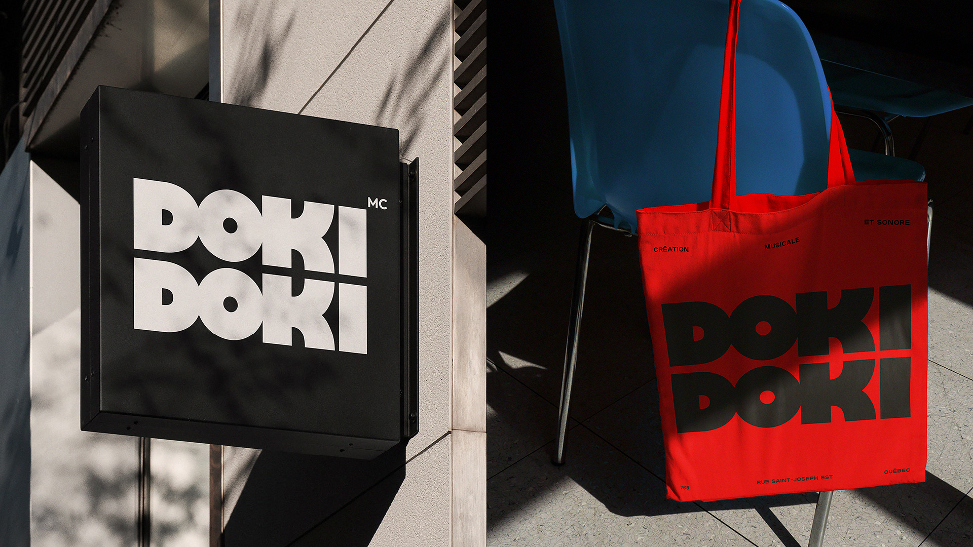
The name comes from a common Japanese onomatopoeia used to describe the heart-pounding feeling in your chest when excited – precisely the kind of emotional response the studio generates with every project. When flipped 90 degrees, the “OK” letters in the logo transform into the two players at the heart of every project: client and studio. Player 1 and player 2.
The brand universe is constructed from the most common onomatopoeias from video games, animation and film, letting the two players loose to play in an infinite audio world – a comprehensive visual system made entirely from sound as a graphic device, expressing how the studio sees sound differently.
Everything from the logo to the fonts to the colour palette was intentionally chosen to make as much impact as possible in as many formats as possible, both online, offline and on social. The specific red chosen is known as Bright Red. It creates a subtle vibration when seen on-screen and is known by printers as the boldest red in the spectrum of printable colours.
To launch the brand internationally, they created “Posters You Can Hear”, a minimalistic series of graphic posters that uses a simple typographic approach – using nothing but the logo and the brand’s minimalistic all-caps font in a single weight – to create a universe of sound in the viewer’s imagination using common onomatopoeia from classic video games.
Since its launch, Doki Doki has been a global success, garnering millions of impressions and receiving praise across top international design publications. Most notably, Brand New – the world's leading source for opinions on branding and identity design – applauded the brand for its "deceivingly simple approach that yields a very playful yet restrained identity that perfectly captures what
Doki Doki does."
More importantly, the agency helped this newcomer studio open its doors with a wave of new clients eager to collaborate, sparking a feeling of heart-pounding excitement (Doki Doki) within the global gaming community about the
possibilities of sound.
Credits
No Fixed Address:CCO: Alexis Bronstorph, Kelsey Horne
CD and Designer: Jean-Philippe Dugal
ECD: Stuart Macmillan
Strategy: Renaud Gingras Debien
Account Director: Nicole de Ravel
Production Artist: Gavin Gillespie
Production Manager: Sheila Jacklin
Partners:
Motion Design: Catherine Camiré
Photography: Pierre-Nicolas Lessard
Stylist: Mary Lynn Kimberly
Makeup and Hair stylist: Mayssa Bahmed
Doki Doki:
President and founder: Michel Labrecque
Music and Sound Design: William Dakin, Alex Bernatchez